How to Drive Reader Engagement and Sales With Effective Calls to Action
Creating, publishing, and marketing your books is a lot of work. And all of it will be in vain if you can’t grab the attention of readers. That is the essential goal of your book marketing—to convince potential readers to engage with you and buy your book.
Driving that engagement is often done through a tried and true marketing tool: the Call to Action (CTA).
If you’re unfamiliar with CTAs and how to use them in your digital marketing strategy, you’ve come to the right place!
What Is a Call to Action?
A Call to Action is a marketing term for any text or graphic encouraging someone to take immediate action. The easiest way to understand a CTA is to go to any retail or business site and look for buttons.
CTAs typically come in the form of a button, hyperlinked text, or a linked image in an advertisement, email, or social post. The goal of a call to action is to inspire someone to take a desired action, such as buying your book, signing up for your newsletter, downloading an ebook or other free materials, or requesting more information about your business.
Effective CTAs use attention-grabbing visuals and persuasive language to create a sense of urgency or to highlight the benefits you’re offering. A key part of a good CTA is the placement on your website or in your emails. The CTA must be easy to find, concise, clear, and compelling.
Types of Calls to Action
Every call to action you create, whether for an email, social post, or landing page, aims to drive user action. But within that goal are different kinds of actions you’re looking for. Broadly, you can think of effective CTAs as targeting one of four actions:
- Purchase
- Download
- Subscribe
- Learn More
When a user clicks with the intent to buy, that’s a purchase action. Download actions usually result in your potential customers getting an infographic or report to help them understand you and your business.
When a user subscribes, they are offering their email addresses or connecting through a social platform because they want to hear more from you. And finally, a learn more CTA aims to continue the customer’s journey. These kinds of CTAs need to be carefully looked at to ensure a good user experience. When someone clicks a learn more CTA, they must be directed to content that helps them learn more.
Your Free Lulu Account
Create a Lulu Account today to print and publish your book for readers all around the world
Call to Action Examples
Perhaps the most common example of a CTA is the ‘Buy Now’ button. You’ll find these on any ecommerce website you visit. Because the language is clear and precise, you’ll know exactly what to expect when you click a ‘Buy Now’ button.
Some other popular examples include:
- Subscribe Now
- Learn More
- Download Now
- Get Started
- Sign Up / Sign In
- Contact Us
While these are simplified examples, a great call to action will be specific. Don’t say “Learn More” when you could say “Learn More About Publishing.”
When you can, tailor your CTAs to your target audience. If you produce healthy eating journals, instead of “Buy Now,” you might say “Get Your Health Journal.”
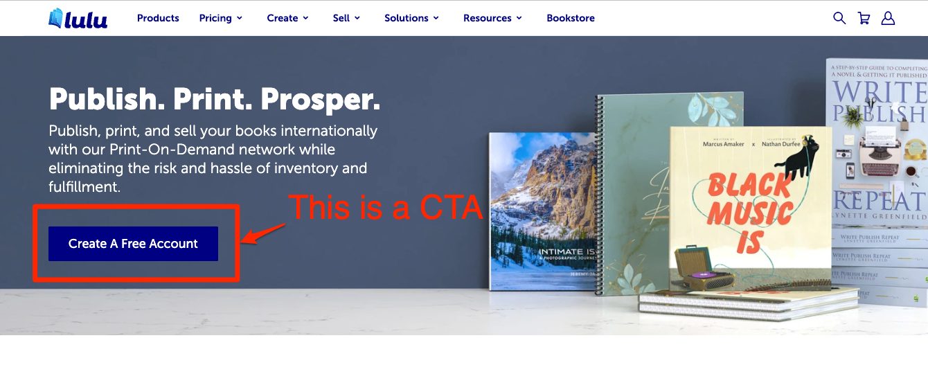
Call to Action Example: Lulu Print Books Page
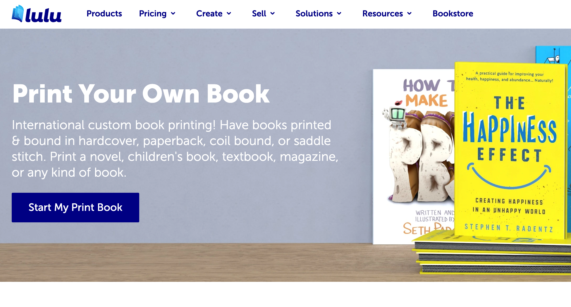
If you navigate to Lulu’s Print Books page, you’ll find this banner (called a ‘hero’ by designers) with a button. The call to action here is very clear: Start My Print Book. We use this language to tell users what they’ll get if they click that button, and because we know from our audience research that users are looking for quick ways to get started once they’ve learned what they need to about self-publishing.
Here’s another example of on-page CTAs a little further down this page:
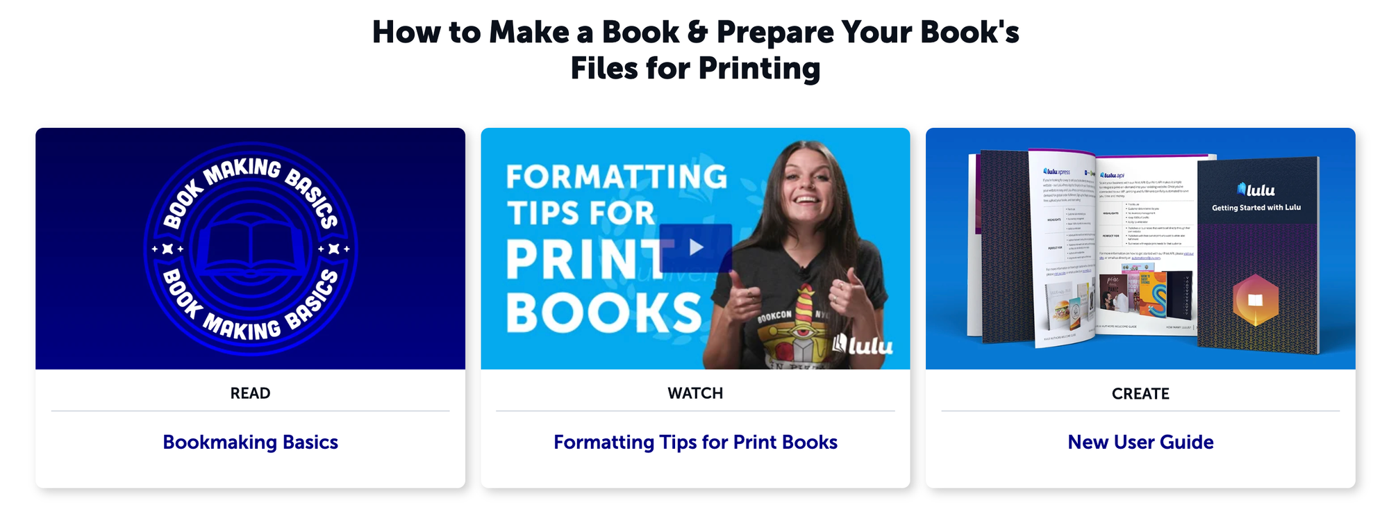
These content blocks each contain educational content about book layout and formatting. The CTAs here are:
- Bookmaking Basics
- Formatting Tips for Print Books
- New User Guide
Again, very specific and clear. We’ve added descriptors above each to help users understand what they’ll get when they click:
- Read
- Watch
- Create
The first link goes to an in-depth blog article about book design and page layout. The second sends users to Lulu’s YouTube channel to watch a Lulu University episode featuring quick tips and tricks for page layout. And the third is a guide with specific instructions for creating your print book.
Each piece of content focuses on book design but does so through different delivery methods. The call to action and accompanying text let readers decide exactly how they’d like to learn how to publish their book.
Call to Action Example: Sparktoro Homepage
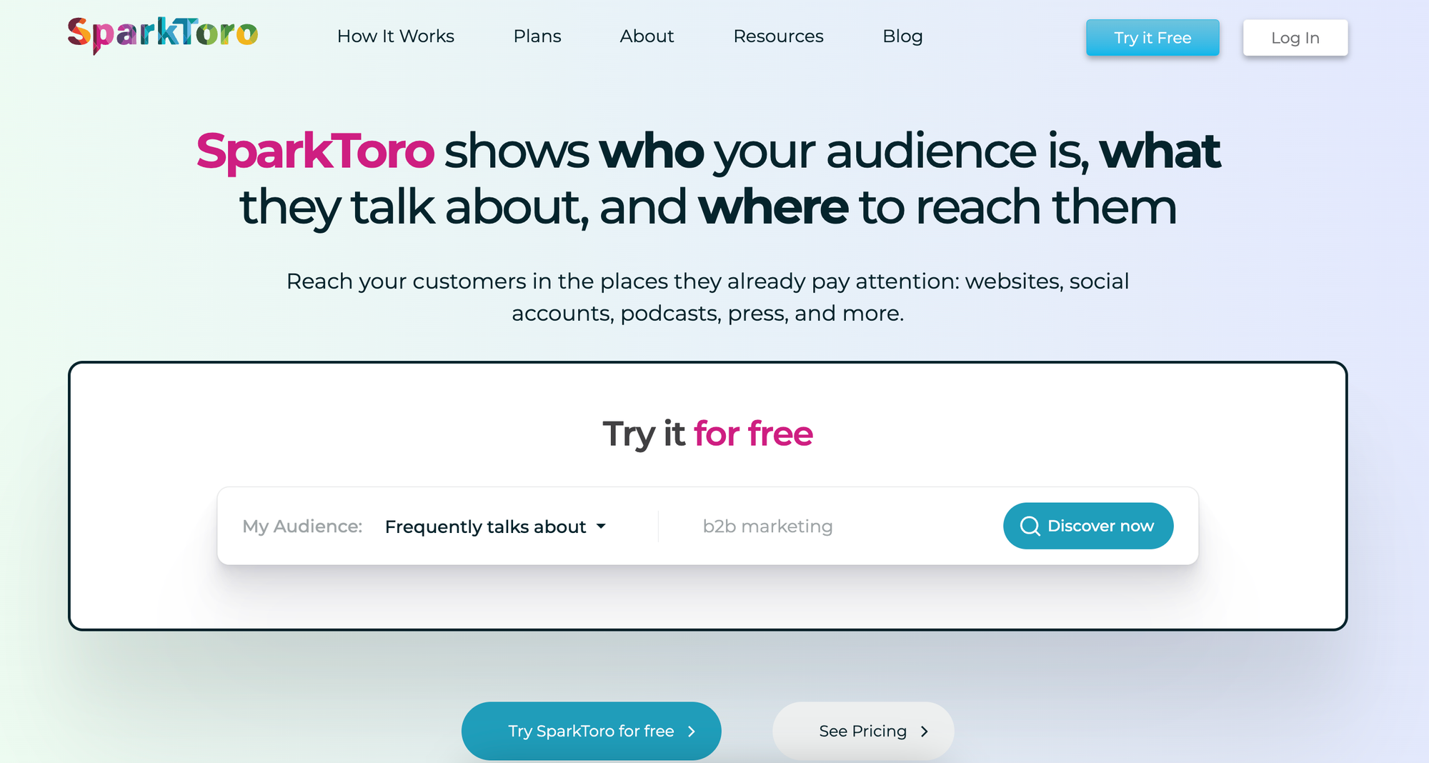
Here we have the homepage for the social listening and audience discovery platform SparkToro. This is a great example because it features multiple CTAs all visible before you even scroll down the page.
Let’s list them out:
- Try it Free
- Discover now
- Try SparkToro for free
- See Pricing
The first thing to take note of is that the first three CTAs I listed above all go to the same page: a new user registration page. Most likely, the folks at SparkToro are watching how users interact with their homepage to see which of the three CTAs gets the most clicks. That might indicate that the specific language of one CTA is more compelling or clearer than the others. That’s valuable knowledge that SparkToro can use to update and adapt its site
The final CTA directs users to a pricing page, letting potential customers understand what it costs to use SparkToro before they set up their account. While the main goal of the page is clearly to get users to take the free trial, they know it’s also key to be transparent about pricing. Having three CTAs on their homepage that all include ‘free’ is risky for a paid service.
Including a link to pricing helps alleviate any confusion about the fact that SparkToro is a paid service. And the words on the button are concise and clear about the fact that you will need to pay to get the most out of their platform.
Call to Action Example: Clever Girl Finance
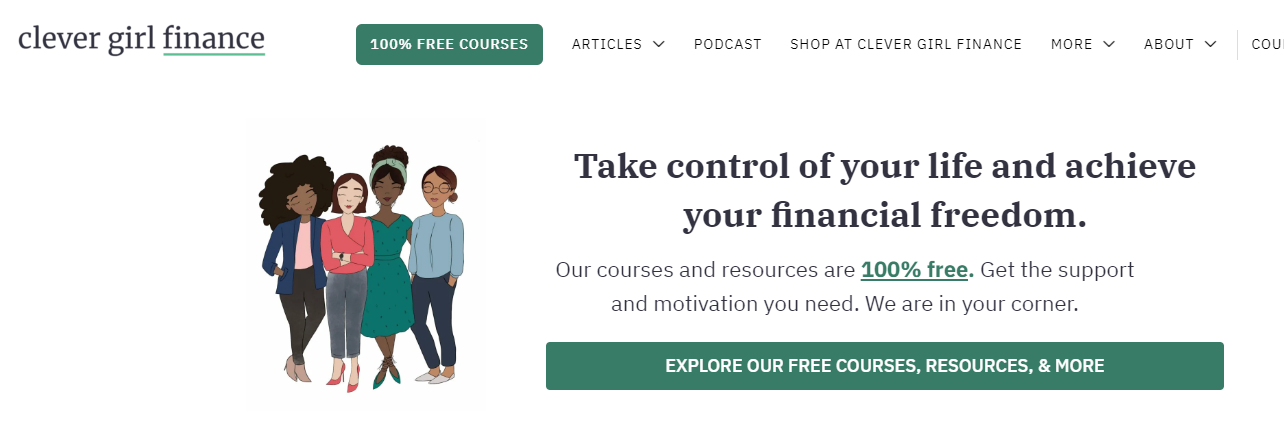
This is the homepage for the financial education website Clever Girl Finance. They make it very clear right away that you can enjoy a wealth of courses and resources for free.
There’s a button at the top of the page (in one of the most popular places people look and click) with both 100% and free in the text. These are both great words to use on your CTA button (as long as they’re true!). Both are eye-catching and help potential users understand the value Clever Girl Finance offers.
Likewise, the long CTA button that follows gives even more details. Using words like explore indicates it will be exciting but not difficult.
Call to Action Example: ConvertKit Marketing Email
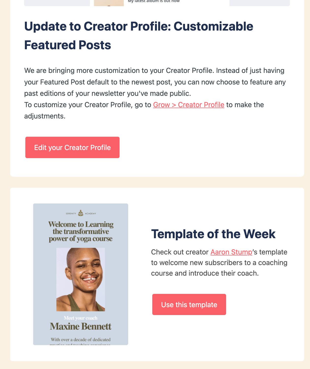
This last one is a marketing email from ConvertKit. Partway through the email, these two pieces of content are stacked. The top is an announcement about an update to their Creator Profile. It contains a text link and a button link. Just like the SparkToro page, both links go to the same Creator Profile page. Using both gives their readers options and allows ConvertKit to get information about the kinds of links their readers will click.
The lower section has two links, but only the button could be called a CTA. Hyperlinking text in this way typically acts as a citation. I’m sure Aaron Stump is enjoying the additional traffic to his Twitter profile.
The button has a clear directive; like the previous two CTAs, this one takes users to their Creator Profile.
Note that both the CTA for the blog post and the template contain active words: edit, grow, and use. This is a key feature for an effective call to action.
Creating Effective Calls to Action
Writing the copy for a button or a hyperlink might seem easy, but in reality, it’s a challenging task. Effective CTAs are precise and short. And they have to be eye-catching, or your reader might skim right past them.
Look at these examples for a CTA to subscribe to a newsletter:
- Sign Me Up For Your Emails
- Subscribe Now
Did you even read all of the first one? There’s nothing wrong with a lot of text in a button. But every word needs to be valuable. No filler.
If your reader needs more information, create headlines and body copy. The CTA is the last step before they do whatever it is you want them to do (shop, read, sign up, etc.). It has to be clear, concise, and specific.

Create Your Book
Use Lulu's free templates to easily create and publish your book today.
Where to Put Your CTAs
Where you put your call to action is nearly as important as the text. Your website should have a number of them, starting immediately on your homepage. Each page on your site should also have at least one.
When placing CTAs on your website’s pages, think about the journey you want that person to take. If they’re on your blog and read to the end of an article, does it make sense to ask them to buy your book? Or should you let them give you their email and get a few more blog posts before asking for money?
There is no right answer. Like the examples above, test out a few different CTAs on your pages to figure out what works for your audience.
Outside of your website, you’ll use CTAs in four important ways.
- Landing Pages
- Emails
- Printed Material
- Social Media
Landing Pages
Creating a landing page for a marketing campaign is a common way to achieve your campaign’s main objective, like capturing new email addresses or selling copies of your new book. If you’ve got a new book coming out, you might want a unique landing page for the book. That CTA would send shoppers to your bookstore to buy a copy.
Or you might have a free PDF ebook as a report or guide. That kind of content is great for lead-capture pages. You can ask for their email address in exchange for the free PDF, letting you run unique email campaigns based on the information you have from that user (namely, that they’re interested in the contents of your ebook).
High-converting landing pages use CTAs liberally, usually with three or more, all directing your reader to the same action.
Emails
Landing pages tend to have CTAs that end a process, like adding an email to a mailing list or buying something.
But email CTAs are different. They’re the start of a journey. That reader is leaving their inbox to go to your blog, social media profile, or website. The call to action here is like glue, connecting the content they have from your email to the content or products they land on.
When you can, let the call to action add something to the content they’re getting.
If my email copy is
“Read this post to get rich writing all day! I’ve done it, and now you can do it too! Get in there and read my post to get my secrets!”
and my CTA is
“6 Ways to Wealth”
I’m adding something to the pitch—in this case, that my scam has six parts. The blog post they would land on would reiterate the “6 Ways” in the title to create that connection from email to the blog post.
Printed Material
Finally, your business cards or one-sheeters should always have a call to action.
Yes, even your business card. Thanks to QR Codes, your CTA doesn’t need to be a button or hyperlink. You should still include text to give context; you don’t want to give your potential customer a QR Code that Rick-Rolls them.
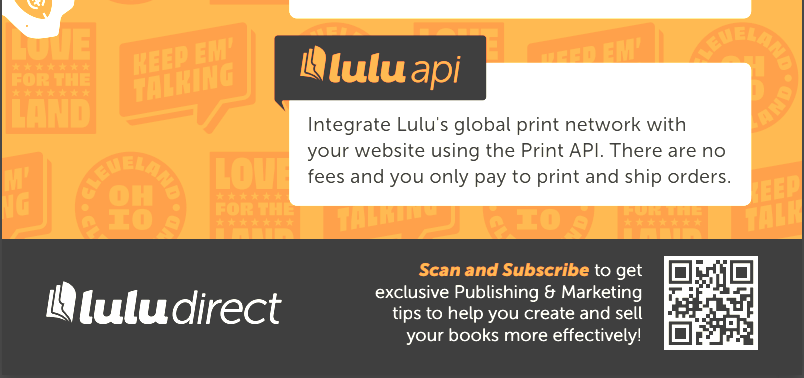
This is a clip from a printed page Lulu used for an event this year. The information next to the code starts with the CTA and provides more information. But you could read just ‘Scan and Subscribe’ to know where the QR Code will lead you.
Social Media
Some of the content you post on social media will need to include CTAs. Not all of it, though. You must understand the platform and the audience on that platform and post accordingly.

Since your social media profiles will vary heavily based on the platform, your content business, and your audience, it’s difficult to define rules or best practices for your CTAs. The key thing here is to meet your reader’s expectations.
Sharing an overview of your new book on LinkedIn or Facebook, along with a call to action to purchase, might be as simple as ending the post with “get my new book here:” and sharing the link. On a platform like Instagram, TikTok, or YouTube, you would need to be more specific with your CTA (“Visit the link in my bio to get your copy of my new book!”). More than anything else, you need to be true to the tone and structure of your social channel. If you don’t normally promote your products on Facebook, don’t abruptly start.
If you do have a book you want to promote on your social channels, leveraging paid ads to reach people outside your community is a great place to test different CTAs.
Using Your CTAs
When I’m tasked with creating a call to action for a new landing page or email, I like to start by reading through all the ones we’re already using. Keep a list and track the different text/button combinations on individual pages. You might find some you can reuse.
Then take some time to draft a few new ones. Be specific and don’t be afraid to make them longer than they should be. You can always edit them later.
That list is a great starting place. I like to take that list and let a few Generative AI tools give me even more ideas.
AIs and Your Calls to Action
Take the list of recycled and brainstormed CTAs and give it to a few different AIs. Here’s a sample prompt.
“I am creating a call to action. It should result in [USER ACTION] and will include the following on-page text [INSERT PAGE COPY]. Using the style of [LINK TO ONE OF YOUR ARTICLES], write 5 call-to-action examples based on this information.”
If you’re using any specific keywords in your CTA, add the following.
“Each call to action should use [KEYWORD].”
You can generate hundreds of examples this way. Most of them will be pretty bad. But you might find a new action word or simplified phrasing that suits your audience.
Your Free Lulu Account
Create a Lulu Account today to print and publish your book for readers all around the world
Make Your CTA Count
Just a few words, but that click is the difference between a new subscriber and a missed opportunity. Or a sale. Be thoughtful about creating your CTAs. And don’t forget about them!
Take the time to review them and make updates to test new ideas. Effective CTAs are a key part of your content business. Don’t neglect or overlook them!