The Secret to Cover Design Success
Let’s be realistic here. No one needs another trite phrase to tell them why or why not their book cover design matters.
A picture is worth a thousand words…
We’ve all heard it before. Cover design matters. It just does. Period.
When you’re self-publishing, you’ve got a choice to make; create a cover on your own or pay a professional to create one for you. But what to do? Pay a pro and hope they realize your vision with a stunning cover? Or go it alone and risk creating something that will turn off readers?
To help you out, let’s review the importance of a book cover and what you should think about when you decide how to handle making the cover.
Do I DIY My Cover Design?
I won’t tell you it’s impossible to sell your book with a homemade cover. Lots of authors do it. I wouldn’t feel good about saying I think it’s a bad idea. But it’s not a great idea. Unless you’re a skilled graphic artist or designer AND you’ve got a good sense of book design AND have the time to design yourself, designing your own cover may not be the best bet.
Don’t let some skills with design and layout trick you into thinking you can design a cover. I know how to run InDesign and can find my way around Photoshop. And I’ve made a couple of covers in my time.
They were horrible. Like, really horrible. Embarrassingly mediocre.
Because I don’t have a mind for cover design. I can’t visualize and manifest a concept. Also, I’m not knowledgeable about designs prevalent in the market. So even if I had the know-how to build a solid cover, I don’t know that I could build the right cover.
Lulu’s Cover Designer
Professional Touch
When you hear someone refer to anything as “professional” there is a tendency to assume that means it is high quality, elaborate, and well crafted. Book covers are no different, but the emphasis will almost always need to be on the “well-crafted” aspect.
Why?
Simply put, a book cover need not be elaborate or complex to be “right” for the book. Professionalism in cover design means understanding where your book will fit in its genre and the broader marketplace. This matters more than any amount of flash or originality. Book cover design is an essential test for designers—working with original and eye-catching elements within a very limited and structured set of parameters.
Your cover really has to work regarding promoting and selling your book. In the digital age, the cover becomes the product thumbnail and is arguably more important than ever in grabbing attention.
This amounts to this—a highly capable and talented designer may not be a great cover designer. Know of this when researching and securing professional help for your cover.
A Picture Is Worth…
How much you pay for your cover will vary depending on a myriad of factors. It’s not unheard of for a cover to run hundreds of dollars. You might end up paying nothing and designing yourself!
I’ll say it again: make sure your cover is the RIGHT cover for your book.
That doesn’t mean you have to pay a lot for a cover. It means you probably should look at professional designers to get a cover that accurately entices potential readers. But don’t spend the money just to spend it.
I know, I’m sounding like a broken record. Just once more: you need the cover that is right for your book more than you need something elaborate or expensive.
For Example…
Let’s look at three covers I nailed it.
Mort(E)
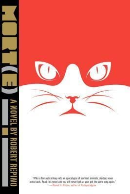
I bought this book about a year ago based entirely on the cover. As a thumbnail, the contrast between white and orange is very eye-catching. It also breaks one of my personal taste rules – using a terrible font – but it does it so well. What I mean is that the cover imagery is so strong, I’m inspired to tilt my head and try to sort out the title. I want to know more just from looking at this cover.
The cover conveys a small piece of the story (it will involve a cat), but the real strength of this cover is in the design. We can tell from the style (and the short review at the bottom) that this is a science fiction book. No other genre could use the stencil-type font used here.
City of Endless Night
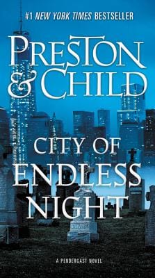
As with any Preston & Child book, you can’t turn around in the book world without seeing a copy.
This cover does two things exceedingly well. First off, it emphasizes the author’s name. We’ve got a name here that is very, very well known. So using that as a major piece of marketing collateral makes perfect sense.
The other thing this cover does so well is to juxtapose the cityscape in the background with the graveyard in the foreground. Coupling this positioning with the title itself and we’ve got a story jumping out at us before we even turn the book over and read the blurb!
Secrets of the Bending Grove

Much like the first cover, we have an expert use of color and space. The effect of the black on white (or is it white on black?) creates an ominous mood. The title tells us there is a secret, and from the tilt of the character on the cover, I can sense that she is bearing the weight of that secret. This cover is simple, impactful, and gracefully done.
The one key element this cover hits, perhaps even more accurately than the first two, is simplicity. For some genres and books, a complex cover can work, but the simpler the cover the more impactful it will be. Readers don’t want to spend time trying to understand the cover, they need to be struck by it with immediacy. Something all three covers achieve.
Making the Distinction
You know your book better than anyone else. Period. That’s a given. It’s a piece of art you’ve created, be it a novel, memoir, historical account, or even something like a manual or textbook. You’ve crafted this thing, massaged it, and designed it until you have a finished product.
Approach the cover with the same mentality. Your cover can’t be an afterthought. In fact, it’s not a bad idea to think about how you might build or design your cover during the writing and editing phases.
The cover can be easy to overlook. You’re a writer, after all, not a graphic designer. Just one more reason you have to think early on about how you’ll design your cover.
To wrap this up today, here are a few pieces of advice I’ve discovered after years of working with and around authors.

Your Free Lulu Account
Create a Lulu Account today to print and publish your book for readers all around the world
4 Tips for Cover Design
- Stay true to your genre. If you write High Fantasy, then you will want a graphically rich cover, probably depicting one of the important scenes from your book or an amalgamation of important events in the story. If you’re writing a piece of non-fiction recounting historical events, use a photo from the time.
- Use common fonts. I love Comic Sans and Apple Chancery as much as the next person. You shouldn’t use these fonts ever. Yes, there might be some situations where a more stylized font is right, but those situations will be rare.
- Don’t take chances. Use your book’s contents to astound your reader with wildly inventive literary feats. The cover is a piece of marketing material as much as art. Yes, it should be well-crafted and attractive, but it need not be groundbreaking. Keep the cover design simple and on-point. You want to capture their interest, yes, but you don’t want to scare anyone away.
- Be original. I know. I just listed three reasons to be boring, now I’m saying be original. This is the challenge of designing an awesome cover. You want, as much as possible, to meet the reader’s expectations, but you also want to do something that makes them pause and really give your book a look. I have nothing specific to advise on this one because it really is a challenge each book has to confront.
Closing Thoughts on Cover Design
I could go on and on looking at and critiquing covers, but the real takeaway is this: you need to make the right cover for your book.
So I guess I owe everyone who has read this far an apology. I started this promising a ‘secret’ to a great cover. But there isn’t really one. The secret is open and many authors and designers already know it. Be simple. Be honest. Most importantly of all, craft a cover (either yourself or with the aid of a designer) that speaks to the readers you know will want to read your book.