
Which Font Should I Use for My Book?
If you’ve asked yourself this question (which I assume you have), I’d like to take this opportunity to tell you to relax. There’s no need to agonize over your book font choice.
That’s not a free pass to ignore the font for your novel though. There’s a sweet spot; you need to look for the best font to print a book in without becoming overwhelmed or petrified with all the choices out there.
The typography you use for your book is important. But what’s more important is not precisely the font you choose. Rather, you need to select a book font that complements your graphic design and page layout while meeting your reader’s expectations. All while going unnoticed by those same readers.
Here’s the thing: if you pick fonts for your novel well, no one will notice. But if you pick your fonts poorly, everyone will notice. Selecting the best, standard book font for your book will directly impact the reading experience for your customers.
Understanding Fonts
Font (or typeface) is one of those writing and publishing-related terms you’ll hear often used to describe a few disparate things. I don’t want to get into long and technical explanations of everything that goes into fonts, so let’s just do a few quick bullets with the most important info for our post today.
- Font – the combination of the family, weight, and size of a letter.
- Typeface – synonymous with the font.
- Font Family – the subset the font is based on; Times is a font family and fonts like Times New Roman or Times Bold 18 point are examples of fonts in the Times family.
- Serif Font – a ‘serif’ extends the letter to add style and help your eye track the text.
- Sans Serif Font – plain lettering without a serif.
- Font Size – the size of your letting based on the points sizing scale.
- Weight – the line thickness of the letters, and elements like bold and italics.

The font is just one of many page design considerations you must balance when creating your book interior. The line length, height, page size, page margins, and letter spacing are just a few elements that are affected by your font choices. And that’s just the interior. Your book cover fonts are important too—for all the same reasons.
Why Fonts Matter
If you go pick up any book off your bookshelf, you’ll likely be able to find five or six different fonts in use. For example, you might use a block-style font for the title (like Gotham) and a serif font for the subtitle and other cover text (like Caslon). Then you’ll have your primary font for the body text (like Baskerville) and another stylized font for your chapter titles (like Bigshot One). Alongside those, you could use unique fonts for your front matter, header/footer content, and loads of other kinds of text—section titles, footnotes, dedication, etc.
There’s no one answer to how many fonts you should use in a book, but if you’re putting your book together and you’ve got more than six different fonts for the interior and cover; tone it down. Too many fonts can be jarring for your reader.
The best fonts for books will be invisible. The text on your page must convey your words, meet your reader’s expectations, and be easy to read.
Compare these samples of the same copy with differing fonts:
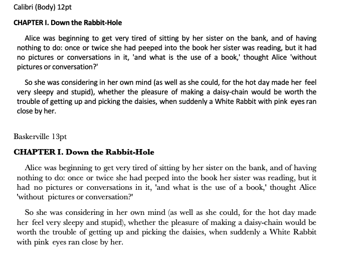
Calibri is Word’s default and looks just fine on the screen. Thick lines, no serifs, ample white space between the lines. Then we have Baskerville, a very common fiction font. Can you see why? It might be a touch hazy on your screen since I’ve screen captured from Word, but the lines are thinner and the serifs create horizontal consistency that leads the eye from word to word.
If I was laying out a novel for printing, I would never use Calibri while Baskerville is my go-to.
Choosing the Right Book Font
This is what it’s all about, right? Creating your custom book so it looks amazing. And making sure every line of text is a pleasure to read.
Putting all those expectations into perspective, how do we ever decide on a font for our body text? When there are literally thousands to choose from, the right answer is to just keep it simple. Why use a font that looks like Baskerville when you can just use Baskerville?
The most important of your font’s many jobs is to go unnoticed. Using a common font, one you can reasonably assume your readers are familiar with means they’ll likely never think about your choice.
Compare these passages and the fonts:
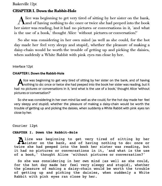
Each of these three fonts is great for printing—but each has a specific kind of printing they’re used for. Baskerville is among the best print fonts for fiction novels. Then we have Interface; a great web font that is also used for magazines and textbook printing. And last we have Courier, a classic ‘typewriter’ font, that you wouldn’t expect to see in a book but is great for newspapers.
Each of these three has a specific purpose in mind, by design and historical use. In context, the right font goes unnoticed. But could you imagine reading Lord of the Rings in Courier? I doubt anyone would get past the first chapter.
Fonts and Your Book
I like to write in Trebuchet. My Google Docs default to Trebuchet. I just think it’s a nice, clean font that looks good on my screen. Yet I would never print a book in Trebuchet. In fact, avoid web-based and Google fonts; they’re not designed for print.
So what is the best font for printing?
Okay, I won’t leave you hanging. We’ll end today with my top fonts for fiction and nonfiction works. When you’re making your own choices, be sure to keep in mind common fonts for your genre and your own book layout.
Choosing Fonts Wisely for Print
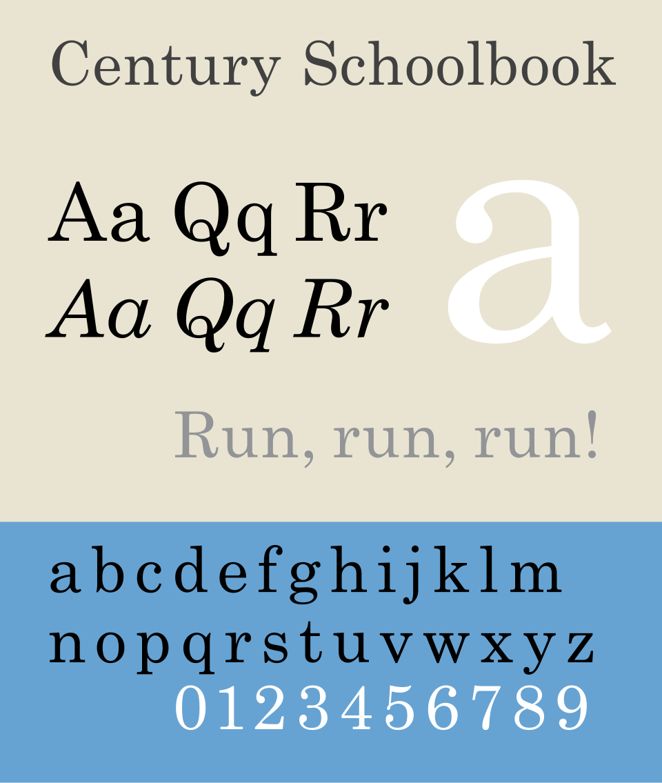
- Century – Century is a great font that bridges the gap between serif and sans serif typefaces. If you’re writing nonfiction and want to capture the feeling one might get reading a blog from your iPad, Century would be my first choice.
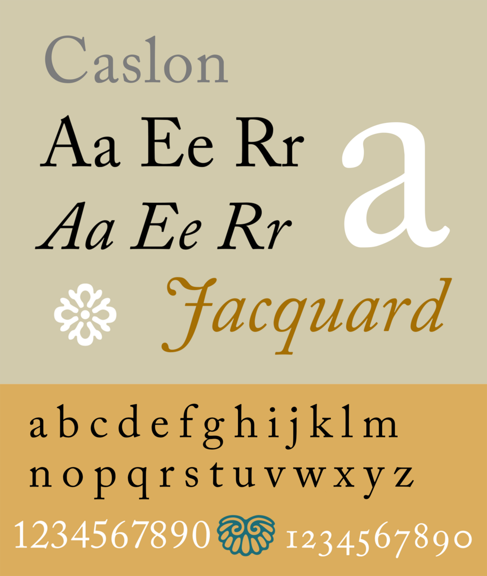
- Caslon – You’ll find Caslon listed as “Adobe Caslon Pro” often in your word processor. This is another older style, Serif font with many similarities to Baskerville. The major difference to my eye is a slightly smaller character with thicker lines. I love this font for nonfiction that still has a casual or lighter subject.
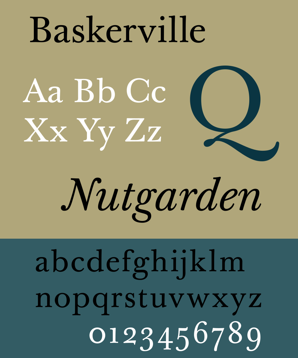
- Baskerville – Baskerville is at the top of my list for fiction books. And for good reason. Developed in the 1750s, Baskerville is a serif font that’s been actively used for hundreds of years. Thanks to its clean appearance and fine balancing of thick and thin lines, Baskerville remains one of the easiest-to-read printed fonts.
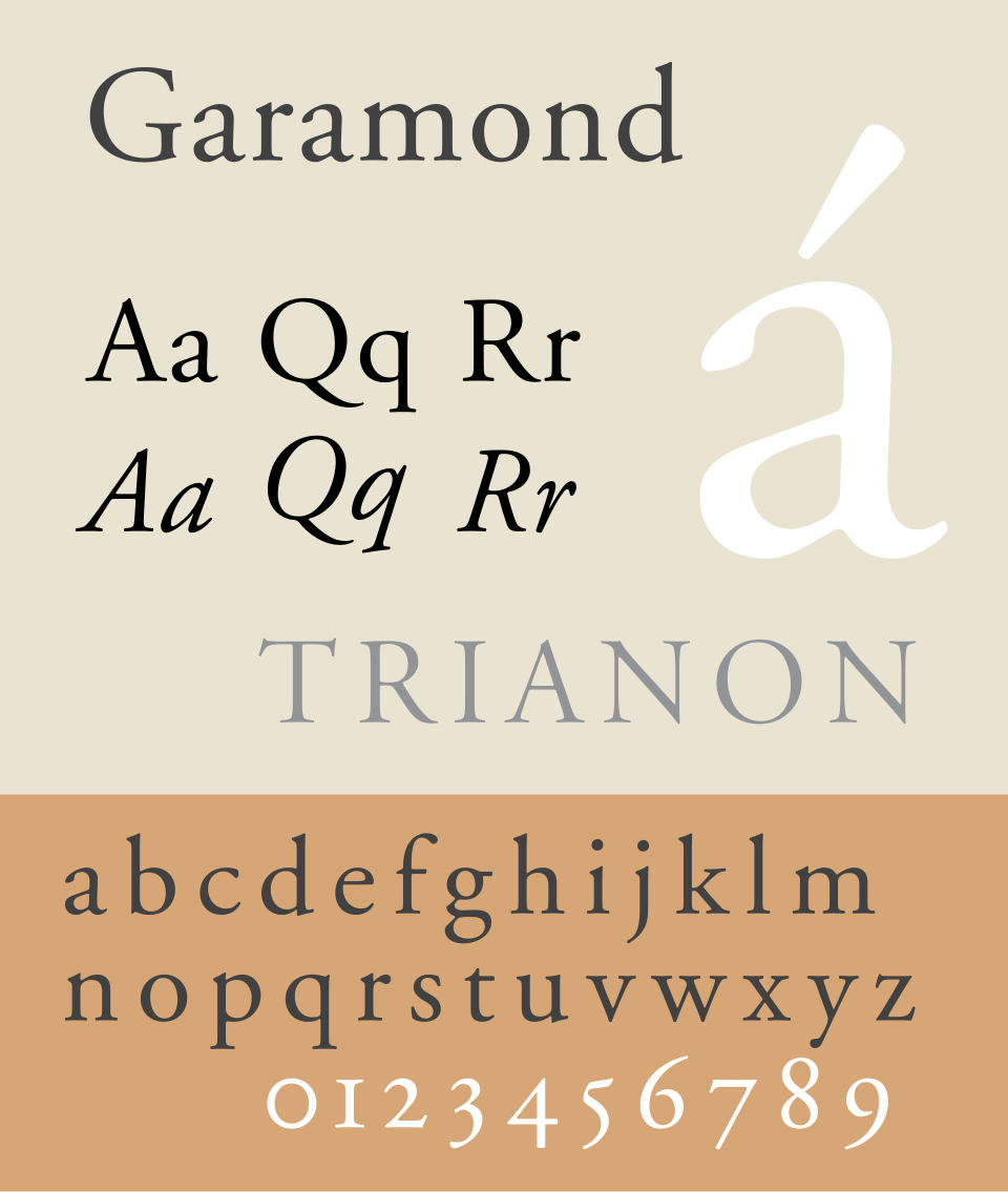
- Garamond – I like Garamond for fiction too. I think of Baskerville for fantasy and literary fiction, while Garamond hits me as more of a sci-fi or thriller type of font. It has many of the same elements as Baskerville, including the thickness and balance, with a slightly more modern look.
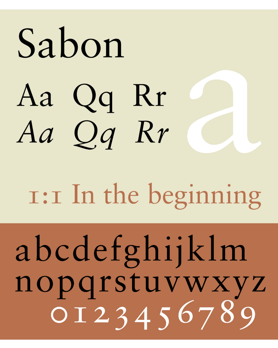
- Sabon – Widely regarded as the best font for romance novels, Sabon is a serif typeface based on Garamond. The text is simple, yet elegant and legible. While most popular with romance writers, Sabon is also terrific as a title or chapter title font when paired with body fonts like Garamond or Baskerville.
Your Book, Your Way
You’ll hear me and many other publishing industry experts point out that independent publishing and print-on-demand mean you own the entire process of bookmaking. That includes decisions about the typeface you pick for your book font. If you really want to use a script font like Comic Sans for the content, you can (but please don’t).
Much like the cover advice I’ve given in the past, you need to find a balance between creativity and meeting expectations. If you write romance novels, your audience has some expectations (some of it even unconscious) about the way the book should look. The art styles on the cover do not differ from the font in this way—it should serve your book and your readers in equal measure.
Take some time while planning your book’s design to pick fonts with your audience in mind. It might seem tedious, but you’ll be pleased when your book is indistinguishable from a traditionally published book. Once you’ve established the fonts that work for your books and your audience, you’ll be ready to keep delivering consistent designs for each new book you publish.