Don’t Cry Over Spilled Ink
For many novelists and memoirists, color space is the least of their concerns. Yet, for artists, photographers, architects, brand managers, and many others in creative fields, color reproduction can be a top priority for book printing. Let’s examine some of the different color spaces out there, some common questions, and which space you should use for your project.
What Is a Color Space?
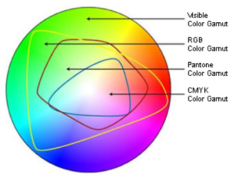
A color space is a range of color values in a given spectrum. The most widely used color space is Standard Red/Green/Blue (known as sRGB), which is used by computer monitors and televisions. Adobe RGB has a wider gamut than sRGB, which can be beneficial for users of specialized print machines. There is also CMYK, yet another color space, named after the shades of ink (cyan, magenta, yellow, and “key” black) used in most printers.
You may have also heard of Spot Color; mainly used in offset and production printing, this can be useful when you have a single, specific brand color that needs to be printed with absolute color accuracy. The company Pantone has its own proprietary color space that brands can use to reference exact shades of color for many types of production, and is one of the leading industry standards of Spot Color systems. Pantone shades are produced with a mix of 13 color pigments, whereas Lulu’s print machines produce in CMYK and are optimized for sRGB.
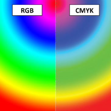
The images below represent the different gamut representations for color spaces. The first is meant to show that there is a hierarchy of colors, from the largest gamut to the smallest: Visible spectrum of colors > Adobe RGB > sRGB > Spot Color > Printable Gamut > CMYK > Grayscale. The second demonstrates the difference between RGB and CMYK spectrums in each color space’s gamut.


Which Color Space Should I Use for Lulu?
It really depends on your content.
I recommend sRGB for many projects. Because it is the default color space of studio monitors, televisions, and computer displays, our print facilities have optimized their machines to run PDFs produced in sRGB. Our Printable Gamut is larger than standard CMYK but not as large as RGB. sRGB is the closest standard color space to what we produce, meaning our printers won’t catch every shade, but it allows for the largest possible set of colors that can be printed.
Because of this small difference between sRGB colors and our Printable Gamut, I recommend getting a proof copy before placing a large order or making your work available to the public. This allows you to see what our machines can offer for your file, and you can adjust individual image settings to boost their final output.
If your file is already set up in CMYK, then you likely do not need to convert it to sRGB. Your screen will fairly accurately show the final print product. Working entirely in the CMYK color space means that you should be able to see the accurate colors, but it also means that you have fewer colors to work with. Neon shades may seem muted, and some pinks may look more like purples.
What If I Don’t See “sRGB” or “CMYK” When I Save My PDF?
Some programs, most notably Microsoft Word, use the RGB color space and will output in the same unless specific color management has been applied. While the word processor is great for text-based books, it can be challenging to get images finely tuned. I recommend preparing all images before adding them to the document. This includes assigning a consistent color profile, balancing brightness and contrast, tweaking the size or resolution, as well as other minor color corrections that are needed. Even something as simple as importing all .jpegs or .pngs can help with final file performance.
If you are exporting from your writing software and do not see the color space you want (sRGB. CMYK, or Grayscale), then you should try proofing with the available options in your program. An example we found was from Affinity Publisher: they have multiple RGB channel options, but none are sRGB. In this instance, I would recommend exporting the same file with different settings applied to see how the files perform, both in upload and in the proofing process.
After you have proofed with your available options, you may find that you did not get the exact results you wanted. At this point, you may want to consider using different software to handle your files. Some freeware can be limiting, but the good news is there are many technology solutions to choose from, so feel empowered to explore all the options at your competency and price point. You may also need to reconsider colors and shades if they aren’t coming out well in the proofing process. If a neon pink doesn’t look right, would a dusty rose shade work instead? If you need a bright color, would yellow be acceptable? Strike the balance between compromise and maintaining the integrity of your vision.

Create Your Book
Use Lulu's free templates to easily create and publish your book today.
Which Color Shades Don’t Print Well in Either sRGB or CMYK?
As mentioned above, neon colors may not show up as brightly in print as they do on screen. This has to do with the use of light for color representation: all the colors in a screen combine to create white (additive color), and all the colors of print combine into black (subtractive color). Pinks and blues can come across muddy-purple in print, despite being bright and punchy on the screen. Pastel colors can also appear desaturated or muddy if the color value is outside our Printable Gamut. The best method is to test your content with a proof copy and make adjustments from a reference point specific to your project.
When Should I Convert Color Spaces?
If you complete a proof and find that many colors in your file just don’t seem right, then you may want to consider creating a copy of your original file and saving it with a new color space. Converting from sRGB to CMYK will make for a more predictable print, but converting from CMYK to sRGB allows you to get a few more shades of color that would otherwise be lost. You should always review images after they have been converted! They may need subtle tweaks to make them pop in final production.
Can I Use More Than One Space?
Please, no!
Some programs allow you to add images of any color space and retain that same space in the final PDF output, but it is best for all elements of a submitted PDF to share the same color space. Even if you assemble your file with various color spaces (most common is a mix of grayscale and sRGB), it is best to convert the final print-ready into a single color space. This reduces the file size and complexity, which in turn makes uploading and processing at the printer much easier. Additionally, by having one color space in the file, you make diagnosing and troubleshooting any potential problems much easier later on.
When Should I Use Grayscale?
Most text-based projects, such as novels and memoirs, don’t have any colors in the interior file. Even if there are graphic elements, if the final intent is to print in Black and White, then you may benefit from working in or converting to the Grayscale color space. This can produce a more consistent and predictable print across our network, as CMYK and sRGB still carry color information. When a black and white file is printed in a different color profile, it can cause an unpredictable color cast in some instances. Working in the Grayscale space reduces this chance and makes the final print more predictable as you develop it.
What About Bits/Channel and Other Settings?
If you want to get really technical about it, then you should make sure your file has 8 Bits/Channel in its color profile. This reduces the file size and complexity, which makes it go through our system much more easily. Many designers prefer to use 16 Bits/Channel, but this may cause unnecessarily bloated files to overload the processors at our printer, potentially causing a printing error. The more “lightweight” and “clean” you can make a file before uploading, the more consistent your print will be across our global network.
Best Practices
- Start with sRGB if you are making a file from scratch
- Try CMYK if you want a more accurate preview when working
- Use Grayscale for text-heavy PDFs, or content without any color
- Test changes made with a proof copy, or start with a proof to help guide any future tweaks
- Duplicate the file, then convert the color space
- Adjust individual images as needed
- Be willing to compromise when it makes sense
- Do research specific to your project, genre, software; or reach out to a community for feedback
- Reach out to our Print team with follow-up questions to help get your work printed
- Follow Lulu for more tips and suggestions from our team of industry experts


