The Ultimate Guide to InDesign for Authors
This is your ultimate guide to the basic ins and outs of using Adobe InDesign to create a PDF interior for your book. InDesign is a unique program that focuses on laying out files for printing—making it perfectly suited for book design.
The Learning Curve
If you’re familiar with Word as your primary writing and layout tool, InDesign brings with it a few differences you must acclimate to. In particular, you’ll notice differences in the way the toolbar (or “ribbon” for Word) is set up and organized. Getting yourself set up and working on the file will be a little different too.
Once you get past importing your manuscript and getting a working file in place, using InDesign to finesse the layout of your book is an absolute pleasure. If you’ve struggled with section breaks, text justification, page sizing, text styling, or page numbering using Word, you’ll find InDesign to be easy, intuitive, and all-around much better to work in.
Let’s get into it.
Watch Interior and Cover File Setup for Adobe InDesign
Getting Started
I’ll be using a public-domain version of Arthur Conan Doyle’s Sherlock Holmes to show how we’ll create a book. It’s a collection so each individual story will act as a chapter in a longer work.

On the very first screen, we’ve got two main ways to start a document: Recent and Saved.
These are self-explanatory and much like Word’s Page Set Up options. I advise you to save common sizes to keep your interior files consistent and make it easier when you prepare your next book.
There are a few options that we need to look at in that right sidebar:
- Page Size – Set the unit to your preferred measurement option and plug in the FINISH size of your book pages. You’ll see I have 6 x 9 (in inches) because I’m making a 6 x 9 book.
- Pages – Be sure to check for Facing Pages. This treats the left and right pages differently and ensures a clean gutter space. We also must enter a page count. For this document, I entered 100, but remember that we can easily change the actual page count once we create the document.
- Columns – The column will be set to 1 with a 0.25” gutter. If you’re creating a textbook or reference book with multiple columns, you’ll control that here. Again, columns can be added or removed later too.
- Bleed & Slug – For a book, the bleed is the key thing to include here at 0.125” on all sides. I can click the button on the right to bind the dimensions and make them all match. It is advisable to build your book for bleeds, even if you aren’t using them to fill a page with image content – it just ensures your file will accurately represent what your final printed book will look like. For print-on-demand, the slug can be ignored and should be left set to 0.000.
The Document
Before we go into the preparation steps for your book file, let’s look at the main document screen.

- This drop-down will show you some toolbar options. The Book toolbar is probably most useful for you, but you can also customize these toolbars from Window in the top menu bar.
- The tools we’ll need. The most important ones are:
- Pages
- Paragraph Style
You’ll notice in the above screenshot that “Paragraph Style” is missing. I had to pull it from the “Window” menu and add it to the sidebar.
- The Ribbon for commands. Your options here will change based on the objects/elements you have selected, showing you the choices you have relative to the part of the page you’re working on.
- A two-page spread for our book! The outer (red) lines are the bleed. This is how big the paper will be when rough cut and the inner edge of the page will be the final cut area. The inner lines (purple) show the margins I set. This makes it very easy for me to see exactly where I should orient content (text and images) to keep them within my margins and trim area.
Spend some time pressing buttons and using the selection tools on the far left to get a feeling for how the document acts and reacts to different commands. It is not exactly the same as Word or other word processors, but there are many similarities.
Making a Book File
Once you feel comfortable with the commands, we’re ready to make a book file!
To start that process, we need to open the Pages toolbox and create some Master Pages.
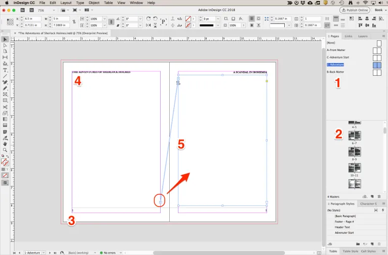
You’ll notice I’ve expanded the Pages toolbox on the right and I have the “Paragraph Styles” toolbox nested below. These are the two most important and useful controls for creating a text-based book, so I will focus on using them.
So, what’s this Master Page thing? Look again at the image above. On the right, you’ll see a page list (#2). And above that, you’ll see Master Pages (#1). Each page in your document will have a Master Page that defines elements of the page, like the header, footer, text box, and pretty much anything else you can imagine.
Understanding the Page
- Your Master Pages. You have a variety of control options by right-clicking in this area. You’ll see in the image I have four Master Pages (plus [None], which is a default blank page). We’ll be creating more to divide up our files in a moment.
- The Page Layout panel displays your pages in spreads. The black lines are actually zoomed outlines of text. Obviously, you won’t be reading anything in this panel, but it indicates which pages have text on them. Also, notice in the outside corners of the small 1? That shows the Master Page in use for those pages. You can select pages (one or multiple) from this menu and right-click to changes in those pages, including applying a new Master Page.
- Alright, now we’re working on the file! See that small 1: on the outer edge of each page? Those are actually placeholders for page numbering. The 1 is a reference to the Master Page. In the actual document, the number will update to the page number.
Just create a text box (the T icon on the left toolbar) and insert the placeholder for page numbering: Type > Insert Special Character > Markers > Current Page Number
I want to make sure the placement of my page numbers is consistent throughout the book. With my textbox created and the Marker inserted for page numbering, I copy the entire box and paste it on the facing page. Remember, this is a Master Page, so it will serve as the layout for all actual pages.
With the text boxes mirrored (because I copied the original), I can align both to the bottom corner of my safety margins. Finally, I want to select the option to align text away from the spine. This pushes the page number in both text boxes to the outer edge (away from the spine). - For the Header, I’ve got the title of my book on the left, and on the right, I have the title of the chapter (or in this case, the short story). Again, we want to align text away from the spine so the text position is consistent throughout.
- Each page has a text box in it, spaced to provide room for text without running over the page number or header content, and staying within the margins I set. You control the size of this text box, and you can adjust it on a page-by-page basis, or you can set up multiple Master Pages with differing text boxes. That angled line between the pages indicates that the box on the left page is bound to the one on the right.
It’s surprisingly easy to achieve this, simply click the small button on the lower right of the left page and then click the right page’s text box. The boxes will bind together, and when you apply this Master to multiple pages in your document, they’ll continue to flow together.
Page Numbers
About Page Numbers and Master Pages: Some pages, like the first page of a chapter or a blank page, won’t want the page numbering. You might not want the Header text on these pages either. Setting this up is as easy as creating a new Master Page, like the C- Adventure Start page I created to make a Chapter Title page. You can also use the [None] Master Page to completely blank the formatting on a page.
InDesign’s command to add sequential page numbering will adjust while compiling, making the page numbering a breeze. And any page that doesn’t include the Page Number instructions will skip displaying the number. The same goes for the header text. We’ll look even more closely at page numbering in the second part of this series, including how to set a specific page as page 1.
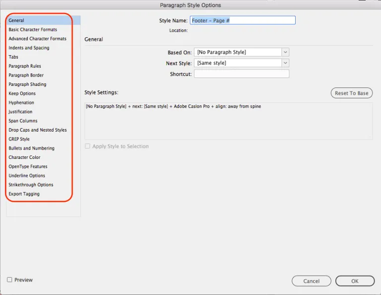
Next up, we need to define some Paragraph Styles. I’ve placed this toolbox below my Pages toolbox on the right. Just right-click any existing style to edit or create a new one. I could fill an entire blog post going through these different Paragraph options, so you should click through each of the options on the left and learn a little more about them.
The Ribbon
It’s also important to note the options in the Ribbon while you’re active in a text box:

You can change a specific paragraph using these controls (they are very similar to the Word ribbon controls) and with a right-click on the Paragraph Style, you can update that Style to match your changes, filtering the change down to all other text using that style.
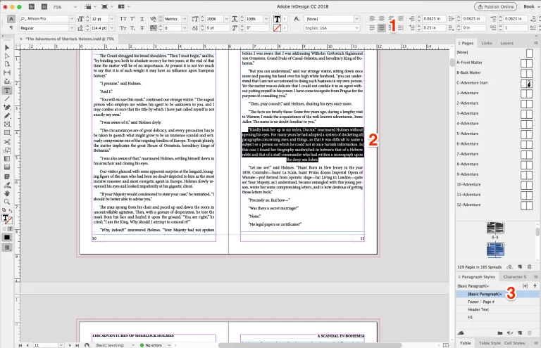
In the above image, you can see I’ve changed the paragraph style to Justified-Centered (1) for the highlighted text (2). Because this text used [Basic Paragraph] for its styling, that Paragraph Style now shows a + (3) beside it. A right-click and selecting Redefine Style updates the style to match the text. Or I can click the + to shift the selected text back to the original style (undoing the formatting changes I made).
Finally, Some Text
All the prep work is done. I’ve got a document with a Master Page for each chapter (or story, since this is Sherlock Holmes) and each Master includes page numbering and Header text placements I can adjust as needed. I also have a Front Matter/Back Matter Master and an Adventure Start Master I can use to create a title page for each story.
Before we paste in our text, let’s look really quickly at this Master Page:
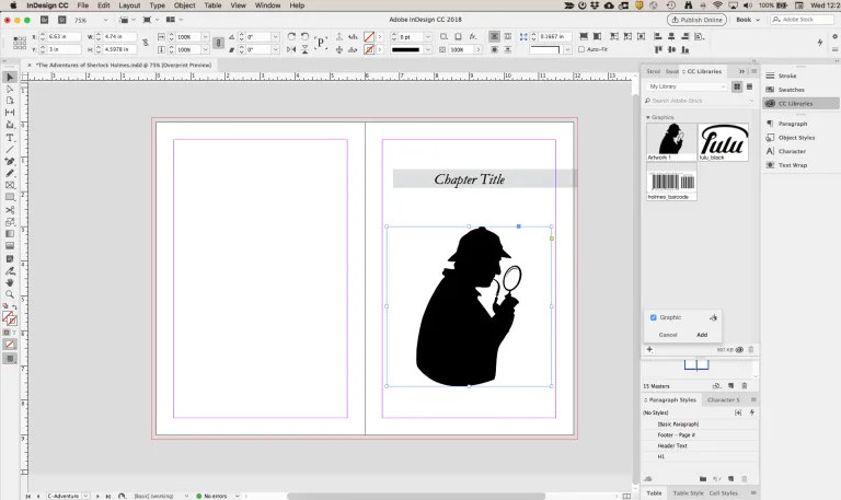
I’ve added a nice stock image of a detective and a bit of specialized text (Paragraph Style = H1) to make a title. In the Master Page, I used Chapter Title and in each individual placement of this Master, I’ll edit the page to include the actual title of the story.
I don’t want to dig too deeply into adding images, but there are a few specific controls for images we’ll look at in the second part of this series.
Let’s Add Some Text!
Okay, so we have our Masters set. I will add the Adventure Start Master to the second and third pages, ignoring the very first page for now. Don’t sweat this, we will put some Front Matter in later.
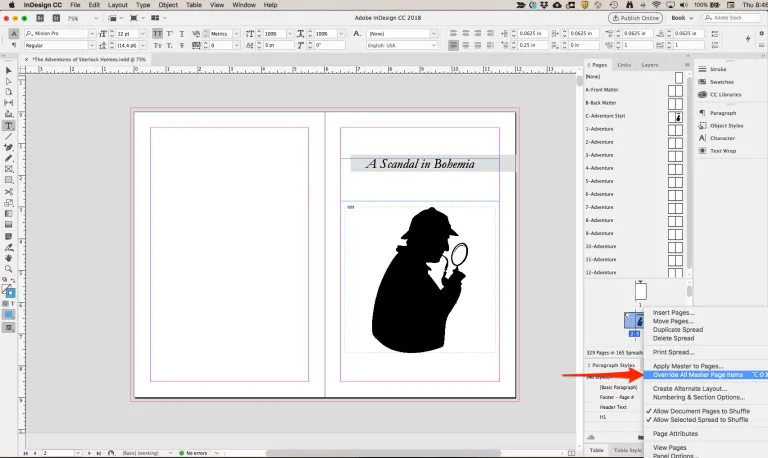
With the Adventure Start Master added, we must free it up for editing. Right-click with the pages selected and Override all Master Page items so we can edit the text. Now we can add the Adventure title (for this first one, “A Scandal in Bohemia”).
The next step is adding the actual text. I’ll jump over to my Word document where all the text lives and Copy the contents for “A Scandal in Bohemia.”
Back over to InDesign, I need to add two more pages using the 1- Adventure Master. To do this, we need to right-click again on Page 3 and choose Insert Pages:
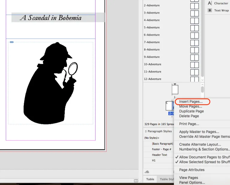
This will pull up a menu and allow us to add several pages and apply Master Page formatting to those new pages.
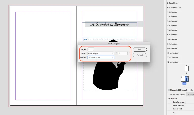
Adding Master Pages
Be sure to review all four items in this window. Add two pages to get the spread from the Master Page, insert ‘After’ the current page which is referenced based on the page selected, but can be updated from the drop-down, and finally be sure we select the correct Master.
The two new pages will be added with the Master settings—including the Adventure name in the Header—and we’ll be ready to paste that content in!
I’ve got far over two pages of content here, but because I bound the text boxes as flowing text, InDesign will add pages, using the 1-Adventure Master Page, until enough are added!
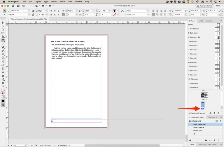
We started with 5 total pages (the first blank page, the two pages from our Adventure Start Master, and the two pages from our 1-Adventure Master), and now we have 30 total pages!
We are working in spreads so add a [None] Master Page for page 31, then add two more pages with the Adventure Start Master, again unlocking them and editing the title to the second Adventure. Finally, we add two more pages using 2-Adventure, the template for our second Adventure and paste the contents in.
Doing this means we have distinct Master Page control over each chapter (Adventure) and we can easily paste in all of our content.
Content Added, Next Steps
Our main content is all added and we’re ready now to add Front and Back Matter, format the text to our liking, and export a PDF so we can get this book printed! Stay tuned for the second half of this series, coming in two weeks, and we’ll wrap up the basics of creating a book with InDesign!
Before we really start tinkering with the content, let’s add our Front Matter and Back Matter. If you aren’t familiar with this content, check out a past blog we did covering the two. I’ll add a quick list of what each contains (generally):
Front Matter
- Half-title
- Blank
- Full title
- Copyright
- Dedication (Optional)
- Also by {{Author Name}}
- Acknowledgments (Optional)
- Blank
- Table of Contents
Back Matter
- Acknowledgments (Optional)
- About the Author
- Advertising for backlist or upcoming titles
- Sample from a forthcoming title
- Connections to your social media, author website, and Newsletter
Your book doesn’t have to include all of this content. It probably should, especially the Front Matter, but this is self-publishing and you are the boss. If your book benefits from a lack of these elements by all means, take the liberties.
Except for the Copyright Notice. It doesn’t have to be at the front, but you really (really) should include this notification.
Front Matter
For my Sherlock Holmes reprint, I created seven total pages of Front Matter.
- Half-Title
- Blank
- Full Title
- Copyright
- Stock Image
- Blank
- Table of Contents
This is a standard setup and follows the suggested ordering I listed above. I didn’t really need to acknowledge or dedicate this book, so I left those two out. If you’re creating a book with a separate introduction, you might consider this part of the Front Matter too.
To add this content, I made a ‘Front Matter’ Master Page including just the header and footer space and excluding page numbering. The Front Matter is diverse, so no need to make a strict design. I’ll want the freedom to prepare the content uniquely for each page. I went into the Pages toolbox, right-clicked, and selected ‘Insert Pages’. Then I set my options to include seven pages, before page 1, with the Master reference being my Front Matter Master Page.
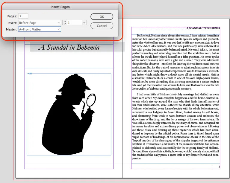
Back Matter
I went through basically the same process for the Back Matter, scrolling to my final page and adding additional pages, this time using my Back Matter Master Page. One thing to pay attention to when adding Back Matter is the page count. My document (before adding the Back Matter) contained 335 pages. I want to have a quantity divisible by four (bookmaking best practices and necessary if I want to put my book into a retail distribution service). So, I will add five pages of back matter to even the page count at 340.
I was simple with this content, adding one page with a little about Project Gutenberg, and one page with a little about Lulu. I don’t have any of the content we’d usually see at the end of a book like the ‘About the Author,’ other books or social contact info, or anything of that sort. My Back Matter is much more simplified than yours will probably be.
Placing Images
Okay, before we get into the finalizing steps to make your text beautiful, I want to touch briefly on images and image placement. I don’t want to go into the details and tricks for graphic layout because I’m really not much for graphic design. Laying out some pages of text, sure I can handle. But artfully placing images and graphics on the page is not something I have a knack for.
Here are two good resources for deeper learning about image placement with InDesign:
The Adobe instructions are very detailed and go through several options for placing your images into the page. The video tutorial, while slightly outdated, covers some good means of manipulating an image once placed.
Okay, with that out of the way, let’s add a stock image to the front matter!
Adding the image
I’m on the fifth page of the front matter, a blank page facing the copyright notice. I have this image of a thumbprint (very detective-y right?):

I’m going to place this on the page just to fill some space. From the File Menu, I select Place and find the file on my desktop.
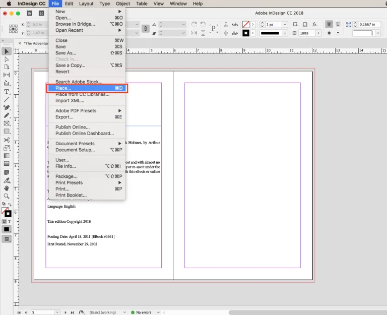
Now I will see a preview of the image attached to my cursor. Drop that image on the page and you’ll see the full-size image inside a frame (#1). Note the circle (#2) in the center of the image. This will allow you to grab the image within the frame and move it without moving the actual frame.
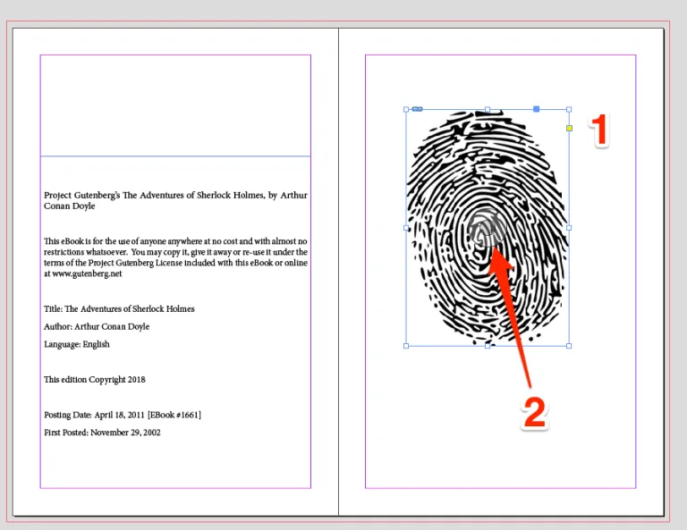
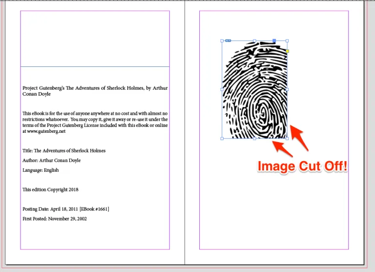
This gives you a lot of control over the final position of the image and the frame it lives inside. You can also resize both the frame and the image, though be careful not to distort the image or cut some images off within the frame.
The video tutorial I linked above does a good job describing the options you have for controlling this, but let me show you the menu to Fit the image. Just right-click on the image once you have the frame size as you’d like it and select Fitting > Fit Content Proportionally.
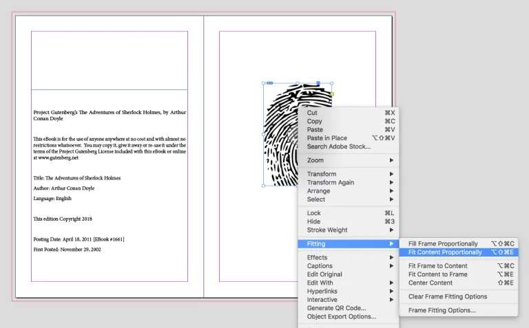
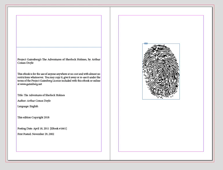
This command will fit the image to the frame you’ve sized while maintaining the proportions of the original image. The Fitting menu offers a variety of sizing options, so I suggest playing with these if you intend to use graphics in your book layout.
Here’s my final placement and sizing for this image:
Finally Finalizing!
We’re almost there. I’ve placed all of my text and front/back matter in the book. We’ve got a file with pages and margins sized to book standards. The final step is to review the file and make sure we are happy with the placement and layout of the text.
First, we need to open the Paragraph toolbox. You’ll find this under Type > Paragraph (#1). This opens a toolbox (#2) and you’ll see in the image below that I’ve dragged it out of the sidebar (just click and drag the toolbox) so I can expand it fully.
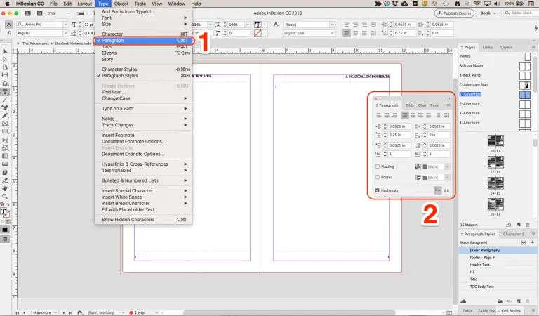
This toolbox will let us control the layout and design of the paragraphs individually. We could go into our Master Pages and apply some formatting rules too, but I want the control to change individual paragraphs.
Paragraph Settings
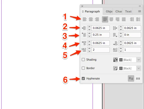
- Justification – This is the same basic control you’re familiar with from Word. The last two in the list are unique ones, allowing you to align away from or toward your spine. This is handy for more complex layouts and your header/footer content. Remember, we used this for the page numbering to keep them consistent.
- Indent – I like to indent my text just a little more inside my margins. Extra safety I guess? These controls allow you to set that value to your liking.
- First Line Indent – I’ve set my first line to indent 0.25”, creating the ‘tab’ look in the finished book for all new paragraphs and dialogue.
- Space Before/After – I like to add some space before and after the paragraphs to create a small gap. This isn’t necessarily a publishing best practice, but it is common with text online. You’ll notice my spacing is very small in the above example.
- Drop Cap – The Drop cap controls define how many lines and how many characters are used for this. It will be the first letter or the first word of a paragraph. I have mine set to two lines, the first letter. Because I’m adjusting each paragraph individually, I’ll need to select the first paragraph of each story and adjust the Drop Cap accordingly.
- Hyphenate – Automatic hyphenation creates hyphens between longer words to maintain the text justification. Look at this side-by-side of the first paragraph of the first story.
Carefully setting Hyphenation
Automatic Hyphenation creates slightly tighter text blocks but results in multiple words broken across lines. You can also edit the text style and control the hyphenation to even greater degrees.
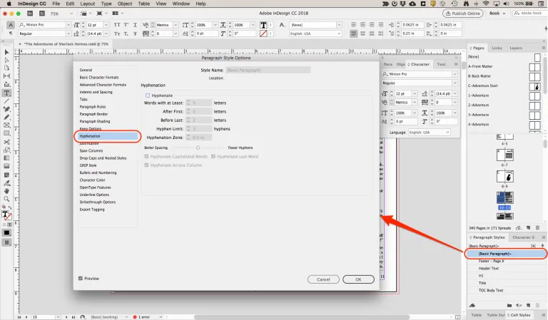
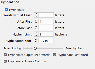
This control gives you a lot of options for the way hyphens behave, so be careful to review your document thoroughly when changing an entire text preset. I like to turn off hyphenation across the border and go back through the file to add it to paragraphs as needed.
What is important to do is to set the hyphenation values you want on this menu prior to turning off automatic hyphenation. This will allow you to turn on the automatic hyphenation for specific paragraphs with the Paragraph Toolbox and get the values you want. Here are the values I set:
Character Toolbox
Now that I set the paragraph controls the way I like them, I’ll review each page and format the individual paragraphs. We’ll use the Character Toolbox, one tab in the same frame as the Paragraph Toolbox.
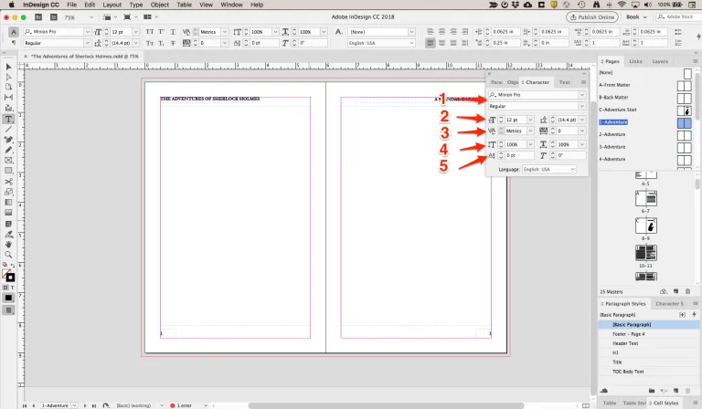
- Font & Style – Choose your font and the style for the selected text. I used Minion Pro / Regular for my basic text, but if I had a quote or other text that I wanted to make stand out, I could adjust the character formatting here.
- Character Size & Leading – The character size is self-explanatory. The leading defines the distance between the baseline of the text. So, at 12-point font and 14.4 points leading, there is a 2.4-point difference, creating a slight gap between lines of text.
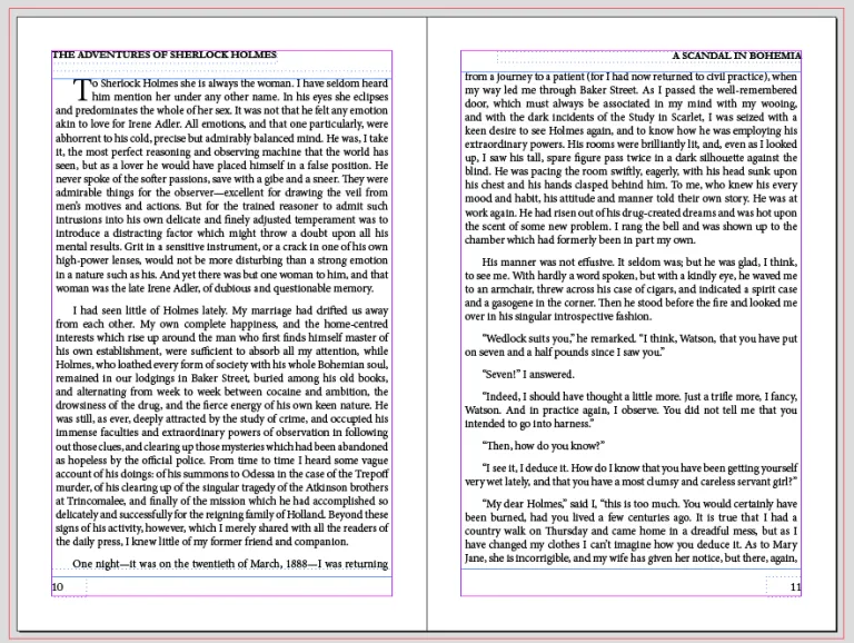
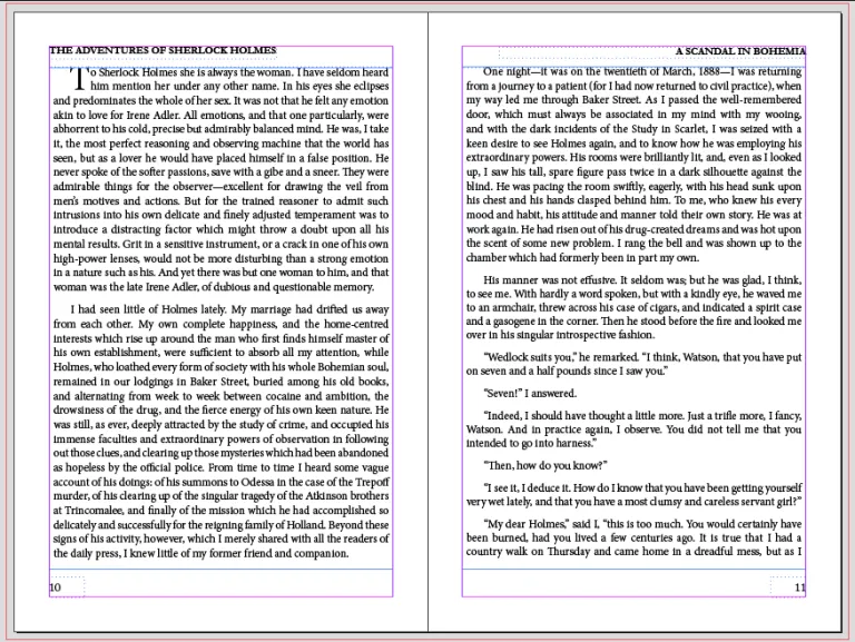
Leading is very useful for controlling lines per page. Look at this example of the first two pages of text, one using 14.4 points leading and the other using 15 points:
Adjusting Text to Fit
With the Leading set to the standard 14.4 point size, I ended up with the first line of the third paragraph on the bottom of the first page of the text. But if I adjust to 15-point leading, we see that line of text shift to the top of the next page. In fact, I could go with 14.8 points leading for those three paragraphs to move the first line of paragraph three to the second page, but doing so tightens the first two paragraphs and leaves white space at the bottom of the page.
- Kerning & Tracking – Kerning defines the space between characters, while Tracking applies to the spacing between groups of characters. I avoid adjusting these as the automatic hyphenation defines these for you line by line. But you can adjust the values to adjust the look of your text.
For example, I like to increase the Kerning between my Drop Cap and the second letter to make the Drop Cap letter stand out a little more. - Vertical & Horizontal Scale – These controls adjust the scale of the text without directly altering the Kerning, Tracking, or Leading. If you reduce the Vertical Scale, the text shrinks but the point spacing stays the same. The Scaling is a control more suited to a magazine layout and probably not something you’ll need for your book layout.
- Baseline Shift & Skew – Baseline shift moves the text baseline up or down. This too is a control you likely will not need for your book interior layout, though a textbook or manual might use this to control text position. The Skew is a “fake” italics effect, tilting the text to a specified degree.
We’ve touched on the most important basic elements and controls for manipulating your text. Believe me, there is a lot more we could cover. But this is an introductory look at InDesign, so we will keep it basic. With what we’ve covered above, you can create a text-based book and design it to look professional.
All that’s left is to generate a PDF!
Exporting a PDF File
Now that we’re done editing the file in InDesign, we can export a PDF ready to upload on Lulu. The first step is to get Lulu Job Options added to your InDesign software. Job Options is a file created by Lulu’s Print Team with all the file presets our printers use. Basically, you can pre-prepare the file for printing before you ever bring it to Lulu, helping to ensure it is quickly accepted by our print-ready file check.
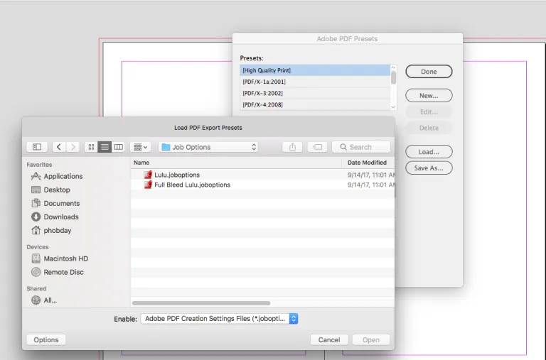
Now go to File > Adobe PDF Presets > Define… and click the Load button.
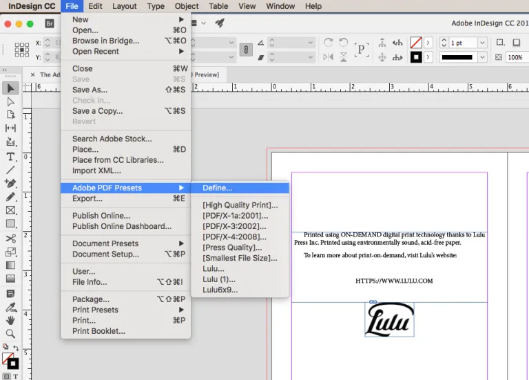
Select the Full Bleed Job Options from the unzipped file folder.
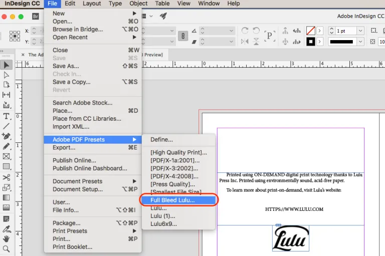
With Job Options Applied, go back to File > Adobe PDF Presets > Define… and select Full Bleed Lulu from the list of options.
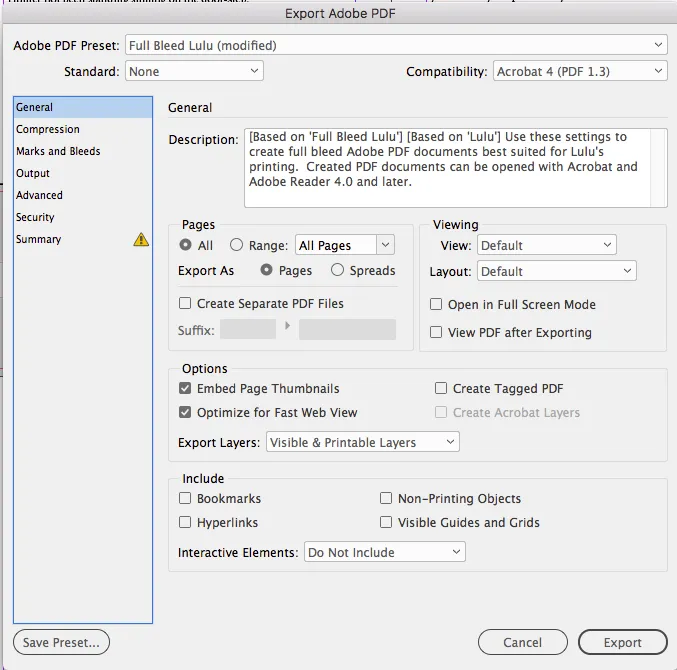
Now you’ll name your file and click Save to bring up the PDF export options. Under the General section, be sure to deselect the option to Embed Page Thumbnails and Optimize for Fast Web Viewing. We’re making a file for printing here!
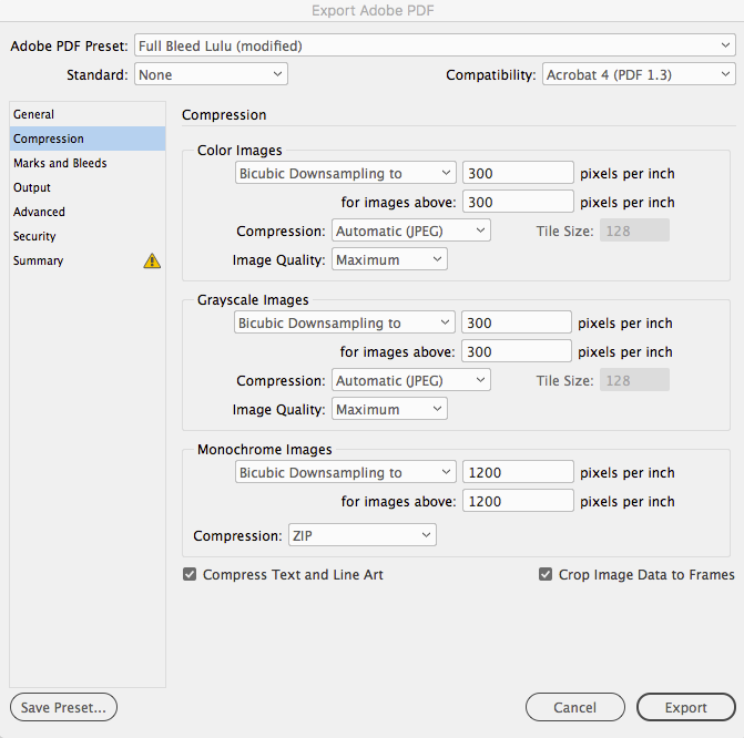
Next, check under Compression and make sure that all images are assigned to export at 300 dpi.
Finally, under Marks and Bleeds de-select the option to display any printer marks. You also want to make sure we select the option to Use Document Bleed Settings, so the file will properly export at the Full Bleed size.
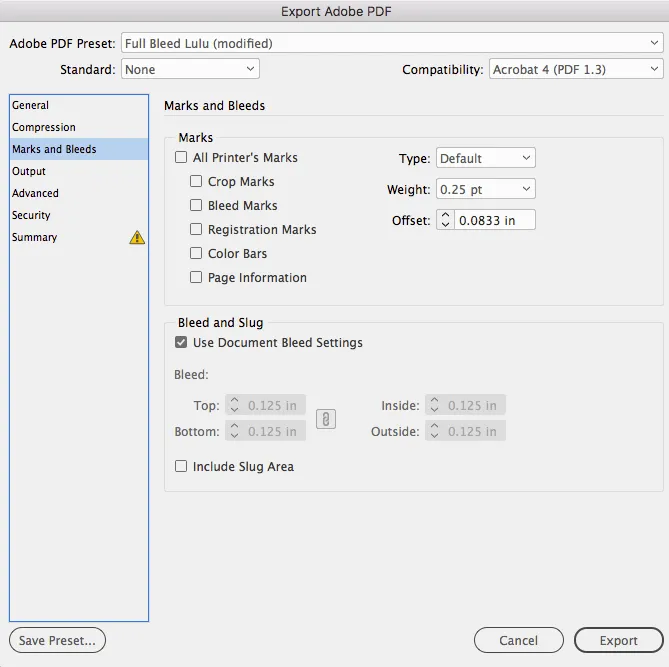
With these options checked and reviewed, click Export to save your interior file as a PDF.
Closing Thoughts
And that’s it! You’ve got a file ready for upload to Lulu.
If you’re interested, here is the completed The Adventures of Sherlock Holmes I created.
InDesign is a versatile piece of software, but they also load it with features that can easily overwhelm new users. Believe me, I know from hours of poking around in the software and still have only a cursory understanding of the graphic design aspects and alternate means of achieving layouts.

