5 Visual Indicators Your Book Is Self-Published
These days, self-published books can be just as high-quality and professional-looking as traditionally published books. In fact, your self-published book may be printed at the same facility that handles books from publishers like Penguin Random House or HarperCollins – same machinery, same materials. So why, then, are self-published books so often easily identifiable?
Or maybe, if you don’t care about your book being self-published, the better question is: why does it matter?
In many cases, the answer is simple: it doesn’t. Depending on what you’re hoping to accomplish with your book – selling it exclusively through an online store, for example, or as a supplement to a class or workshop – it may be irrelevant. But if you hope to one day see your book in a bookstore, or a library, or you plan to hand-sell your book to casual browsers in person, then this blog post is definitely for you.
So let’s take a look at a few key details that are sure to tell the discerning reader, bookseller, librarian, or reviewer that your book is self-published!
5 Visual Indicators Your Book is Self-Published
Imagine you’re walking through a bookstore, browsing for a new book to read. You’re not looking for anything specific, but you’re in your favorite section looking for something that speaks to you. Think about what’s going to make you stop your perusal long enough to pull a book off the shelf. Think about what might make you put that book back on the shelf before you even get as far as reading the first page.
Not sure where to start? How about with the very first thing potential readers will see:
1. Spine Details
Everyone knows the adage about judging a book by its cover, and it’s true; we know that for all the warnings against it, we are all guilty of judging a book by its cover. And when customers are browsing your website, or an online bookstore, then your cover would be the first thing people see and the first judgment call people make. But if you’re hoping to sell your book in any kind of physical retail setting, it’s much more likely that your book’s spine is the very first detail your potential readers will see.
Figuring out the details of your book’s spine can be one of the most meticulous and tedious parts of producing your self-published book. Believe me, I get it – there’s a reason almost every single Lulu book I’ve ever made has been coil bound. But it’s also very much worth the time and effort it takes to get those details just right. I’m not going to go into the steps of how to do so – we have a great blog post that takes an in-depth look at getting your book spine measurements just right.
Instead, let me try to convince you why it’s important.
There’s a pretty reasonable chance that your book’s spine will be the first thing a potential new reader sees. This means it’s incredibly important that your spine has at least two key details on it: the book’s title and the author’s name. If your spine has no text on it, no identifying details to even hint at what the book is, odds are extremely low that any browser is even going to stop and look twice at it, let alone pick it up.
In fact, most bookstores will not stock or shelve books that don’t have the title and author printed on the spine (yes, that includes saddle stitch and coil bound books). If you want to maximize your chances of having your book carried in your local indie or Barnes & Noble, you must include the title and author name on the spine.
Think, again, about that hypothetical bookstore browser. We all inherently tilt our heads to the side to read the side-wise spine text when browsing a bookstore. If your spine has the text in the opposite direction of the rest of the books on the shelf, do you really think that browser is going to make the effort of turning in the opposite direction just for one book? Or are they more likely to skim right over your title and keep browsing?
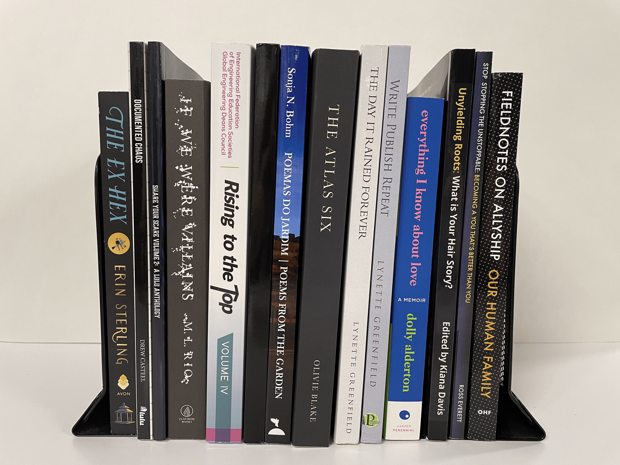
Pro Tip: The third detail that traditional publishers always include on book spines is a publisher or imprint logo. Take a look at your bookshelf – you’ll see an entire row of little Penguins, Random Houses, Anchors, Archers, a few different Hs, and probably many more logos you’ve never paid much attention to. If you want to line your book up with the traditional ranks, consider adding a logo to your spine! You can always use the Lulu logo, your publisher’s logo, your business’s logo, or create your own logo as part of your brand!
2. Cover Details
Depending on how you’re selling your book, your cover is the first or second thing your potential buyers will see. Make sure it looks good and provides enough info that they’re intrigued and want to know more.
Front Cover
We’ve gone on at length about the importance of good cover design, how to design a book cover, and the benefits of hiring a pro to design your cover, so I won’t harp on all of that again here. If you’d like to read more about designing a strong cover for your book, I would recommend checking out a few of these resources here:
- Blog | Canva For Your Cover
- Lulu University | Design Basics for Creating a Book Cover
- Webinar | What Makes a Good Book Cover with Bailey Designs Books
Back Cover
Part of my job here at Lulu (my favorite part of my job, if I’m being honest) is browsing through our online bookstore and in-office library for cool, unique, interesting, and impressive books to share on our site and social media pages. One thing that always surprises me (and disappoints me!) is when I find an interesting book with a great cover and flip it over to find… nothing. Nothing! You put all that work into designing a cool and eye-catching cover, only to give me nothing on the back cover?
Your back cover is an essential marketing tool for your book. No reader is going to buy a book that they know nothing about, and you will not always be there to tell your readers what your book is about! At the bare minimum, your back cover should include your full (and detailed) cover copy (what’s that? We’ll get into that in a minute). But if you really want your book to be on par with traditionally published books, you need much more than that.
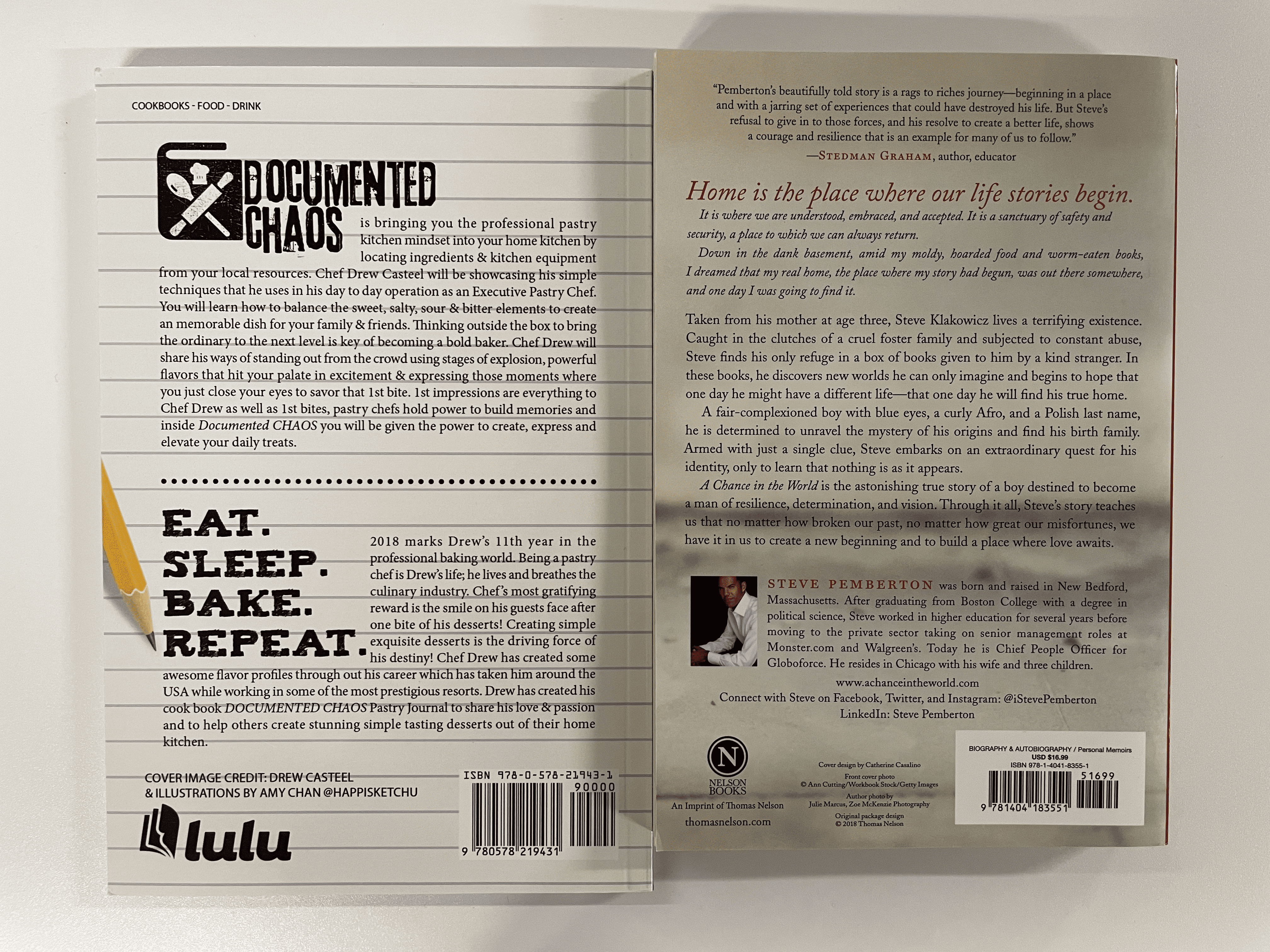
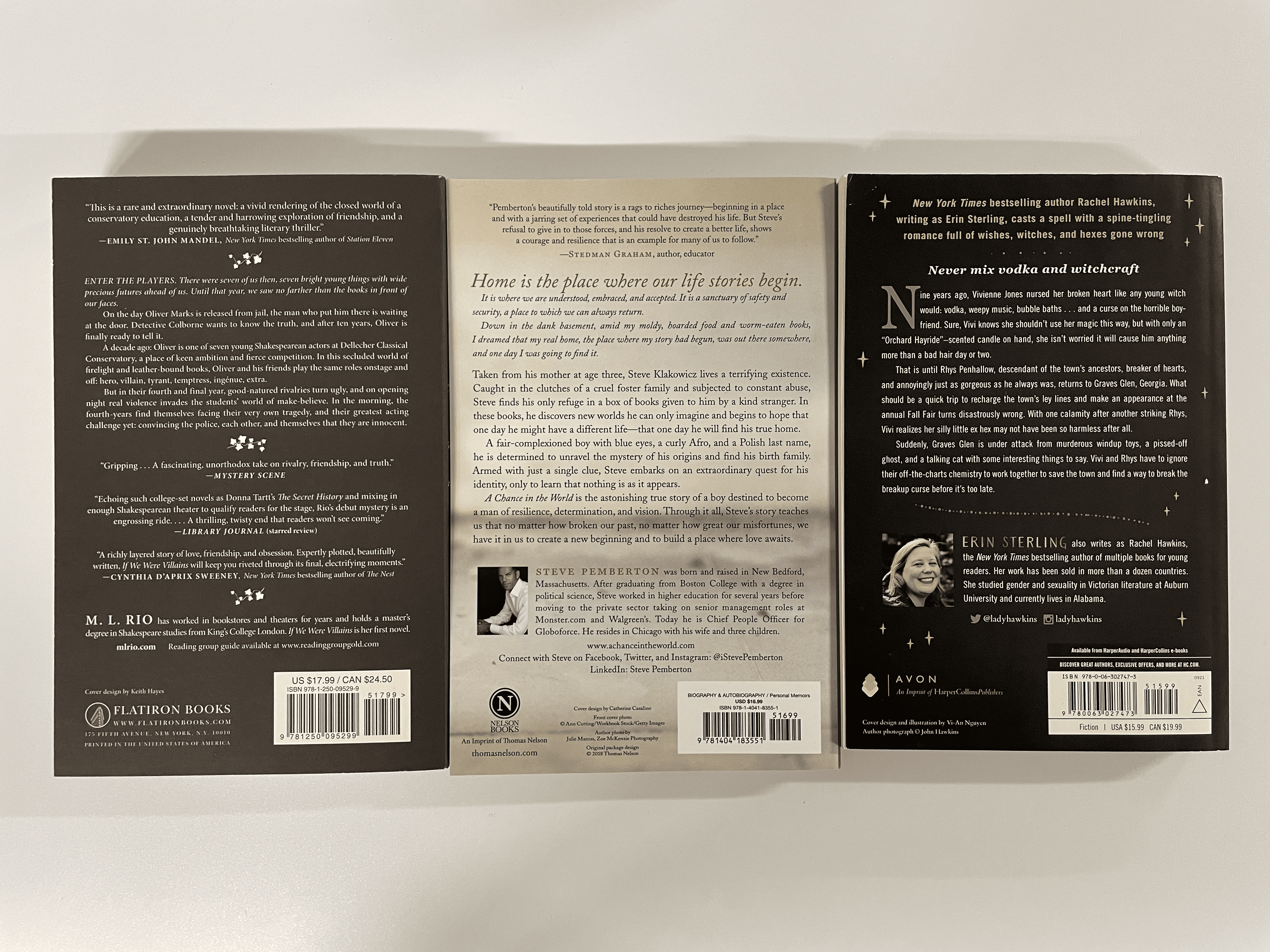
Check out this copy of the Documented Chaos Pastry Journal by Lulu Author Drew Casteel. He nailed the back cover design – it has all the elements of a traditionally published trade paperback book: not just the cover copy, but an about the author section, cover credit, a barcode and ISBN, his publisher’s logo, and the book’s genre. If I saw this on a shelf in a bookstore I’d have a hard time differentiating it from a traditionally published book.
These details aren’t just important for aesthetic reasons! We’ll talk more about the importance of your cover copy shortly, but at least two more of the details here are significant for bookstores in particular: the barcode and ISBN, and the book’s genre. While it’s not necessary, including your book’s genre on your back cover helps both booksellers and book buyers understand where your book fits into their store (and their interests). As for the barcode and ISBN… no bookstore is going to carry a book that they can’t ring up and sell, right? Your ISBN is a very important piece of metadata for your book and is essential for any book going into Global Distribution.
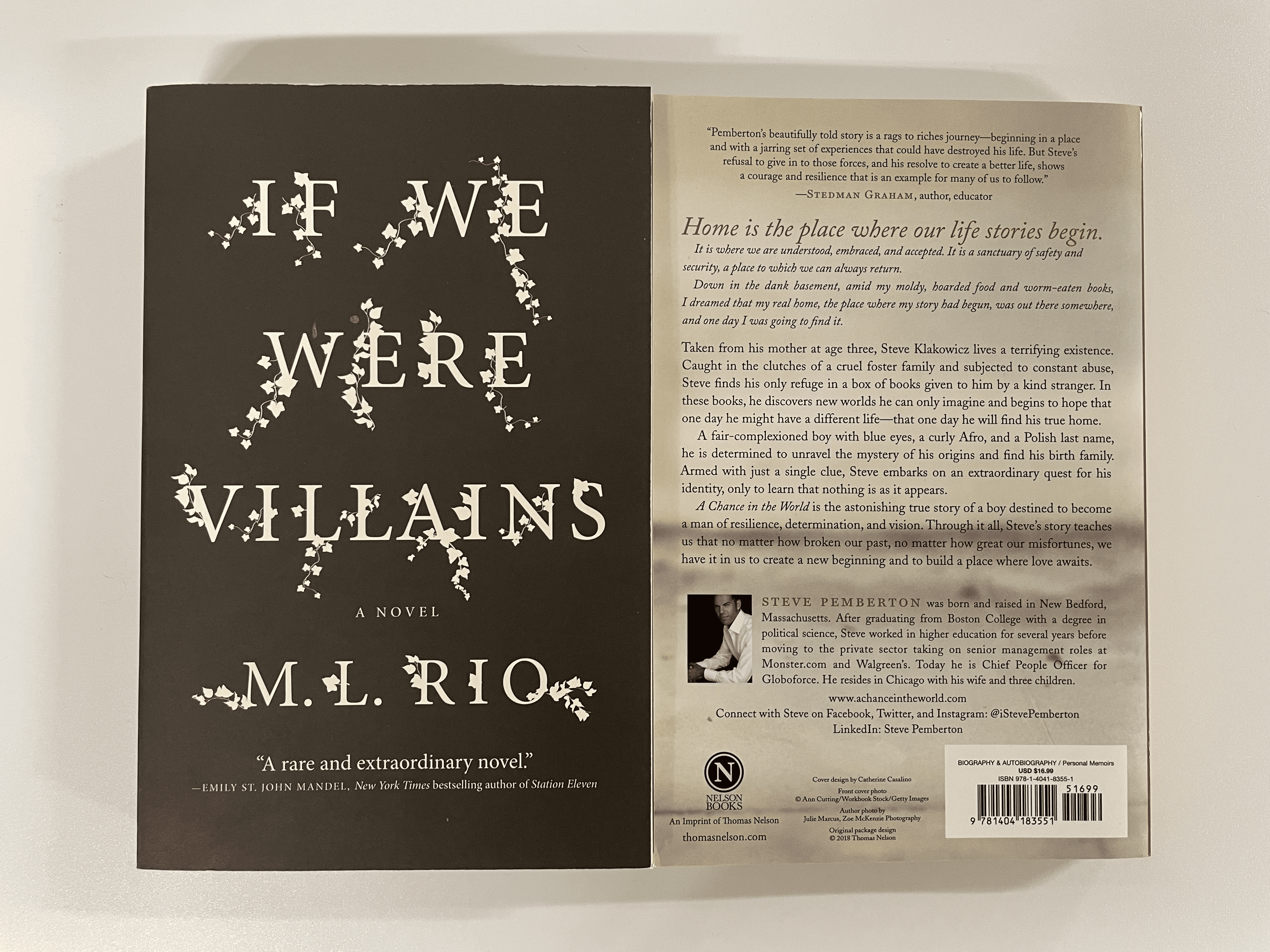
Pro Tip: If you have space to fill on your back cover or your front cover, include a blurb or review! A blurb – one-to-two lines of praise for your book, usually from another author or relevant/significant figure in your field or genre – is a fantastic little marketing asset. They also lend your book a little extra credibility, reassuring your potential buyer that it’s not just you saying this book will add value to their lives, but another person thinks so, too. Check out these examples of a blurb on the front and back covers of two books:
3. Cover Copy
After your cover, your cover copy – or your back cover copy, or your cover blurb, book blurb, book description, etc. – is one of the most important marketing tools you have in your entire marketing toolkit. It is also, unfortunately, one detail that I often see neglected or misused by self-published authors.
Your cover copy should clearly, concisely, and coherently explain what your book is about. For online retailers, including Lulu’s bookstore, any Lulu Direct stores, and many of our online retail distribution partners, this is the only “sneak peek” inside your book that readers will get. You need to use this copy to convince online shoppers that your book is going to provide the information or entertainment that they’re looking for. For in-person shoppers, your cover copy is the next – and maybe most important – step in convincing them to buy your book. You’ve caught their eye with an appropriately designed spine and compelling title. They’ve picked up your book and the cover keeps their interest piqued. They flip the book over to read your cover copy and make the final decision: is this the book they’re looking for, or are they going to re-shelve it and try something else?
Formatting is also important for your back cover copy! You want it to be both aesthetically pleasing and easy to read – it doesn’t matter how good your cover copy is if your potential buyer can’t make out the fine print, and dark gray words on your black cover. Your text should also be justified (aligned with both margins) – but we’ll talk more about that later!
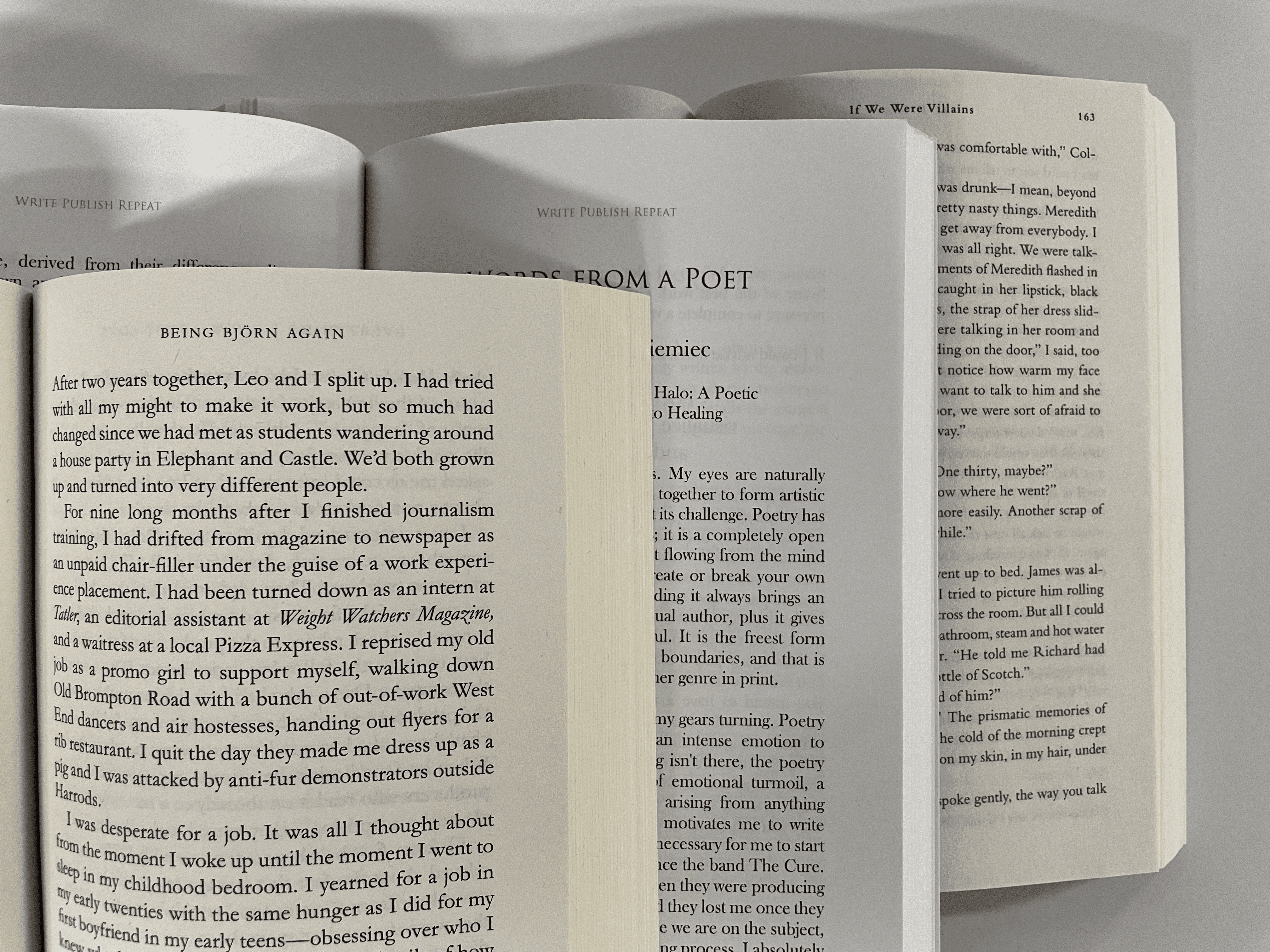
When in doubt about back cover formatting, look at any paperback book on your shelves. Glance at a few of their back covers – even without reading the copy, you can tell just by looking at them if they were designed to match the industry standard:
Check out this blog post for an in-depth look at How to Write a Book Description!
4. Front Matter
Now that we’ve successfully convinced our hypothetical browser to consider our book – thanks to an accessible spine, eye-catching cover, and interesting back cover copy, let’s look at the interior of the book.
Have you ever, in your life, opened a book and found the main text of the book appearing right there on the very first page? No! There is always – in a traditionally published book, anyway – a handful of pages called “front matter” that precede the actual text itself. Your self-published book should absolutely also include this front matter. In fact, if you’re electing to use Global Distribution for your book, you are required to include at least two pages of front matter: a title page and a copyright page.
Traditionally, a book’s front matter is made up of the following:
- Half Title Page
- Full Title Page
- Copyright Page
- Dedication Page
- Table of Contents
There may be some additional pages in there – blank spacer pages between the two title pages, a list of other works by the author, maybe an epigraph. Ultimately, what pages you choose to include in your front matter (minus, of course, the two required pages), is up to you. But no matter what you choose, you absolutely should choose to include front matter. Opening a book and seeing no front matter will immediately alert the reader that this book isn’t traditionally published – even if they don’t realize it – and may detract from the legitimacy of your book. We both know you have a great story or interesting information to share with your future readers. Why limit yourself and your sales by turning readers away from the very first page?
For a closer look at the front matter of a book (and its counterpart, the back matter!) check out this blog post here. If you’d like help understanding and formatting your book’s copyright page, stay tuned! We’ve got a brand-new blog post coming soon with a focus specifically on title and copyright pages.
5. Interior Formatting
We’ve made it so far! Your potential buyer is intrigued, hasn’t seen anything to discourage them, and is finally skimming through the actual body of your book. I’m not talking about reading any of the content, literally just skimming the pages, and checking out the book. This is your make-or-break-it moment, and there are definitely a few things you need to make sure you do with your book to seal that deal.
Justified Margins
I mentioned this earlier regarding the back cover copy, and it’s even more relevant for the interior of your book. It is the industry standard for a book’s body text to be justified. What does that mean? Most of us, when we write, default to a left-justified margin – that means the text is flat to the left side of the page, with the right side uneven as words are cut to fit the size of the margins. A right-justified margin, then, would be the opposite. But, if you take a look at any traditionally published novel, memoir, essay collection, personal growth guide, etc. on your shelf, you’ll see the text does both. The text is justified to both the left and right margins, making an even block of text all the way down the page with smooth edges on both sides:
I’m not going to lie to you—this is a tricky bit of formatting. I’d recommend checking out this webinar on formatting your book’s interior for some great instructions on setting your margins (and the next few things we’ll talk about too!)
Page Numbers and Header Details
A small but important detail—your book should have page numbers! Whether you choose to put them on the top or bottom of the page is up to you, but you should definitely include them. You may also want to include page headers—text on the top corners of each page that says the book’s title, chapter title, or the author’s name, or some combination of the three. Check out a few examples here:

Line Spacing
Another simple and straightforward detail—the interior spacing between your lines. I’ve been surprised at how often I come across a book that has the line spacing at 1.5x, sometimes even 2x. Many of us write that way when typing in Microsoft Word or Google Docs, so I understand why that may seem normal or why you may not even realize you’re spacing your book that way when you go to export your interior file.
But you will never find a traditionally published book with a wide gap between the paragraph lines. And hey, if that’s not a good enough reason, think about it economically—you’re paying for the material cost of printing your book, right? If your book has 1.5 to 2 times as many pages because you put extra spacing between the lines, you’re paying more out of pocket for your book. More expensive print costs = less of a profit margin. So really, printing your book at a standard line spacing isn’t just the traditional choice, it’s the economical choice.
Orphans on New Pages
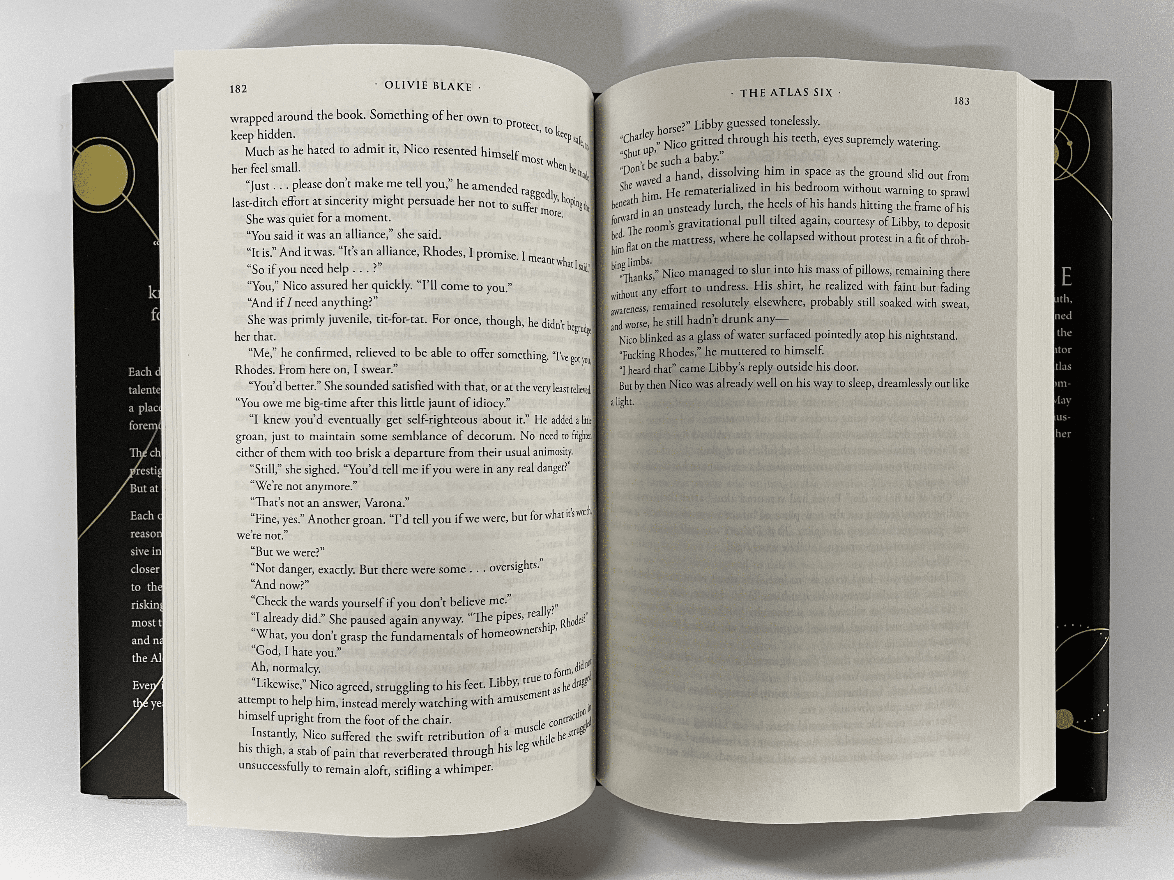
Last year several self-published books found such commercial success that they hit the New York Times and other big-league bestseller lists, including The Atlas Six by Olivie Blake. This fantastic book (really, I recommend it for fantasy lovers) was successful enough – thanks largely in part to TikTok – that Tor Books, an imprint of Macmillan Publishers, picked it up and republished the book.
There were a few very minor details that probably would have caught my eye, had I not already known the book was self-published—errors that a professional editor would have caught, the margins weren’t justified, and the back cover details were a little sparse. But the big glowing sign, for me, came when I turned a page about halfway through the book and saw this:
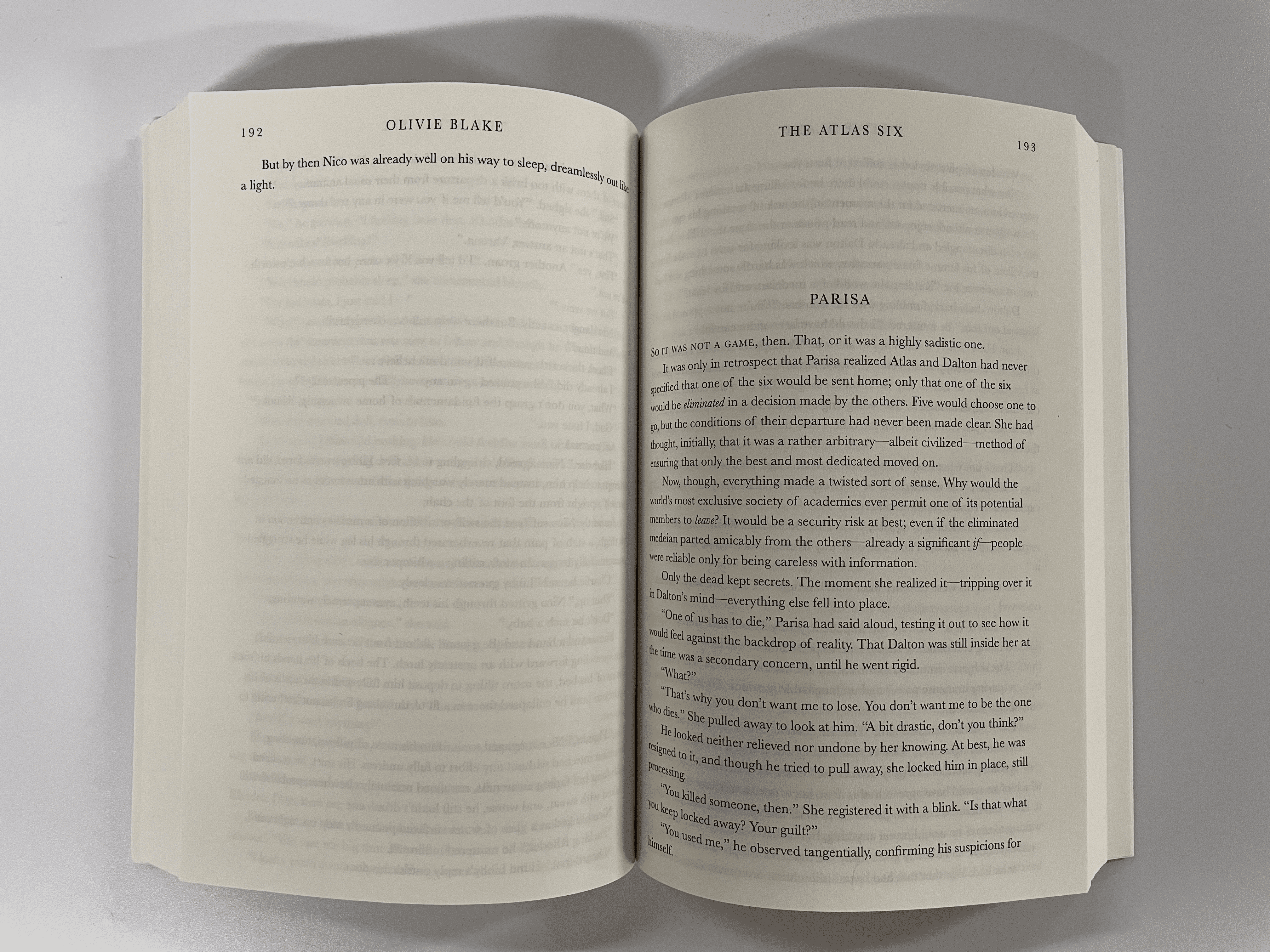
We call this an orphan, a line, or even just a word that has been tragically abandoned onto its own page. Copyeditors at traditional publishers would never let this happen—it’s both a waste of space (and material) and an aesthetic eyesore. At a traditional publisher, this page of the book would have been reformatted so this orphaned line made it onto the previous page, leaving us plenty of room to start the next chapter right here. And sure enough:
Tor did some very light cleanup on this book before republishing it, but one of the details they clearly took care of was that poor orphan line (and, if you’ll notice, the body text justification). Don’t leave your orphans on a page all by themselves—your book will look all the better for it.
Visual Indicators Recap
Feeling overwhelmed by all the details you need to remember? Don’t be! Whether you need a quick review, a checklist for later, or a tl;dr, here’s a summary of what you need to remember when designing your book:
- Your Spine – Take the time to correctly format your spine, including: the title, author, and potentially a logo. Remember, the text goes top to bottom, not bottom to top!
- Your Front & Back Cover – Include as much information as you can to help potential readers understand why they need your book, including: strong front cover design, back cover copy, about the author, publisher information, and a barcode/ISBN.
- Your Cover Copy – Your cover copy is your last chance to convince potential readers that they need to read your book – make sure it is a clear, concise description of what they’ll find between the covers… with just enough mystery to make them want to know more!
- Your Front Matter – Books don’t start on the very first page! To sell your book through Global Distribution, you are required to include a title and copyright page, but you should also strongly consider including: half-title page, full title page, copyright page, dedication, and table of contents.
- Your Interior Formatting – Formatting an interior file takes time and patience, but it’s well worth the effort! Your interior should include: justified margins (to the left and right), page numbers and header text on every page, 1.0x line spacing within paragraphs, and no abandoned orphans.
The stigma associated with self-publishing gets a little better every year, but it absolutely still exists. We know that self-published books have the same power and pride as traditionally published books and that all stories deserve to be told. If you want to maximize your opportunities to find new buyers and readers, it is in your best interests to offer them a book that matches their expectations for an industry-standard book they’d find on any bookstore shelf. Hopefully, this blog post can help!